
This GPT Image 2.5 prompt guide treats a prompt as a creative brief: name the job, describe what the viewer should see, and identify what would make the result unusable. The method applies to photographs, posters, diagrams, interface previews, reference edits, and characters that need to stay recognizable across scenes.
Everything here is written for the website’s browser image generator and editor. Copy a prompt, select the relevant mode, and upload a reference when the example calls for one. This site does not offer a public API.
New to prompting? Start with the fundamentals. For a specific task, jump to the generation playbook or editing playbook. The illustrated cases and refinement sequences show what to inspect after a request. Browser settings and common questions are covered at the end.
About the illustrations: These original AI-generated images document the requests made for this guide. They illustrate the method; they are not website Flare or Sunburst benchmarks. Suggested browser settings are starting points, not recorded generation settings. Read the method and source records.
Prompt fundamentals: what a useful brief contains
Use the fields your task needs. A simple color study may take two sentences; a product edit needs more detail about what must survive. Begin with the essentials below, then turn the important ones into an acceptance checklist.
A reusable English prompt template
Fill the fields that matter to your task and delete the rest. For a loose illustration, subject and composition may be enough. For a product edit, the protected details deserve more space than the mood.
Job: Create [deliverable] for [audience and use].
Subject: Show [who or what, count, appearance, and action].
Composition: Use [viewpoint, scale, placement, and reserved space].
Look: Use [medium, materials, and surface detail].
Light: Use [source, direction, softness, and color].
Text: Render only [exact wording, placement, and repetition; or no text].
References: Image 1 defines [role]; image 2 supplies only [role].
Edit: Change [allowed area]. Preserve [critical details].
Avoid: [specific failures]. Prioritize [the most important requirement].
The job and audience
Start with where the picture will be used. A phone announcement, a product listing, and a classroom slide need different amounts of detail. Name the decision the viewer should be able to make.
Make it concrete: A newsletter cover that leaves the left half clear for a two-line HTML headline.
Check: Would the image still work in its final crop, with the real text or interface around it?
Subject, count, and action
Identify who or what matters, then describe an observable action. Counts and contact points help expose ambiguity: a hand holding a cup is different from a hand resting beside it. Include body framing when feet or hands must remain visible.
Make it concrete: One mechanic, shown from the waist up, looking down at a single wheel; one hand steadies the rim.
Check: Count objects and limbs, then inspect how hands, tools, and surfaces meet.
Composition and scale
Specify viewpoint, relative size, foreground and background, and reserved space. A ratio sets the canvas shape; it does not decide where the subject goes. Choose the ratio in the browser as well as describing the layout.
Make it concrete: Eye-level view; the full wheel fits inside the frame; shelves sit behind the subject and remain secondary.
Check: Are important edges cropped? Can the viewer identify the focal point at thumbnail size?
Medium, materials, and texture
Choose a coherent visual treatment: documentary photography, flat diagrams, gouache, or another clear medium. Describe the surfaces that should carry detail. Avoid stacking incompatible treatments unless you explain which part uses each one.
Make it concrete: Documentary photograph with scratched aluminum, faded cotton, and natural skin texture.
Check: Do materials look distinct, or has every surface acquired the same polished finish?
Light, color, and atmosphere
Describe the dominant light source, its direction, softness, and color. Add a secondary source only when it helps the scene. A lens or film reference can communicate a look, but it does not establish that a physical camera or exact optical simulation was used.
Make it concrete: A large window on the left provides soft cool daylight; a small warm lamp stays in the background.
Check: Do highlights and shadows agree about the source of the light?
Wording and visual hierarchy
Supply final copy, its allowed repetition, and the order of importance. Reserve enough room for the longest line. Separate words that belong in the image from notes addressed to the generator.
Make it concrete: Show “OPEN WORKSHOP” once as the headline and “SUNDAY, 11–4” once below it. Include no other writing.
Check: Read every character in the downloaded file, then check it again at the intended display size.
Reference roles and protected details
For editing, give each uploaded image a job and state what may change. A color reference should not silently replace the subject. List the few details that would make the edit unacceptable if they changed.
Make it concrete: Image 1 defines the room and camera. Image 2 supplies only the rug color. Keep the original rug boundary.
Check: Compare the output with the source, including areas outside the requested edit.
Boundaries and priorities
Exclude specific failures instead of adding a generic wall of negative terms. Resolve competing requirements before submitting. When “keep every letter” conflicts with a dramatic surface treatment, decide which one matters more.
Make it concrete: Preserve the label text even if that means using subtler reflections. Add no extra props.
Check: Could two instructions demand different outcomes for the same part of the image?
Choose a format you can revise
A paragraph works for a small scene. Labeled lines work well when a prompt has several constraints. A structured list can be useful when you maintain many related briefs. The website accepts prompt text; formatting it like JSON does not activate extra controls or make conflicting instructions more precise. Keep the format easy to scan and edit.
Turn vague adjectives into visible decisions
“Make a premium product photo” leaves the product, setting, and composition open. “One cobalt bowl on pale stone, soft light from the left, full rim visible, no props” defines choices you can inspect. Use style words after those choices, not as a replacement for them.
Write an acceptance checklist
A useful brief has three parts: the job the image must do, the details it must contain, and the mistakes that would disqualify it. We call this an acceptance checklist. It turns a vague judgment such as “looks professional” into a small set of things you can actually inspect.
| Decision | Seed-swap cover example |
|---|---|
| Must work | A dark, two-line newsletter headline fits on the left. |
| Must contain | Three envelopes, one seed saucer, and one pair of gloves. |
| Reject if | Objects or strong shadows compete with the headline. |
Swipe the table sideways to read both columns.
Separate a hard requirement from a preference. A missing date can make a poster unusable. A slightly different shade of yellow may not. When both are written with equal urgency, it becomes harder to decide which defect to fix first.
Before generating, remove conflicts: “tight close-up” and “lots of empty space” need a more exact layout; “keep the lighting unchanged” conflicts with “move the scene to sunset.” Decide which requirement has priority.
Image generation prompts for nine different jobs
Choose the deliverable before choosing the visual style. Each workflow below explains what to specify, supplies an original prompt, and names the failure that matters most. The same foundation supports a quick concept and a carefully checked final asset.
Jump to a task
All nine prompts have a generated result directly below them, followed by an observation of what worked and what needs checking. Read or copy the exact request, then compare it with the image. These are individual illustrations, not success-rate tests.
Photography: make style and light visible
Build the scene around an action, then choose the light that makes that action readable. “Cinematic” leaves many choices unresolved. A window, a viewpoint, a focal plane, and a short list of materials give you concrete things to compare. If a result looks staged, revise posture and surface treatment before adding more camera jargon.
Read and copy the English prompt
Create a documentary-style photograph of an adult bicycle mechanic in a small repair workshop, shown from the waist up at eye level. The mechanic wears a charcoal work apron over a faded blue shirt, looks down at a wheel on the bench, and rests one hand on the wheel rim while the other holds a spoke key against a spoke nipple. Show the whole wheel inside the frame and leave clear space around both hands. A broad north-facing window on the left supplies soft cool daylight; a weak warm practical lamp sits in the distant background. Focus on the mechanic's hands and wheel, with the tool shelves gently out of focus. Show natural skin texture, grease marks, scratched metal, and worn fabric. Restrained colors, plausible anatomy, no glossy beauty retouching, theatrical smoke, logos, or lettering. Landscape 3:2 composition.
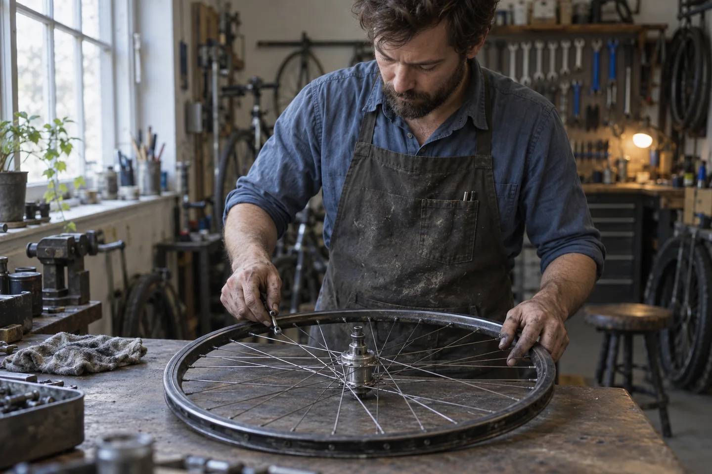
What this output shows: The cool window light and warmer background lamp are visibly distinct. Inspect the hand and tool contact in the original before treating the scene as a mechanically accurate demonstration.
Review the result: Check the grip, tool contact, wheel geometry, skin treatment, and direction of shadows. Camera wording is an appearance cue, not capture metadata.
Process diagrams: specify the connections
Write the steps and branches before choosing icons. The main risk is often a wrong connection rather than an ugly drawing. Explain where each arrow begins and ends, and which outcomes must remain separate. Keep the process small enough to audit without guessing.
Read and copy the English prompt
Create a landscape instruction diagram for a fictional community tool library. Use four labeled boxes: "RETURN TOOL", "CHECK CONDITION", "READY FOR SHELF", and "SEND FOR REPAIR". An arrow goes from RETURN TOOL to CHECK CONDITION. From CHECK CONDITION, a branch labeled "OK" goes to READY FOR SHELF and a branch labeled "DAMAGED" goes to SEND FOR REPAIR. There are no other arrows. Use simple navy line icons, large dark lettering on white, and ample space between branches. Keep the repair outcome visually separate from the shelf outcome. Add no invented steps, numbers, decorative captions, or logos.
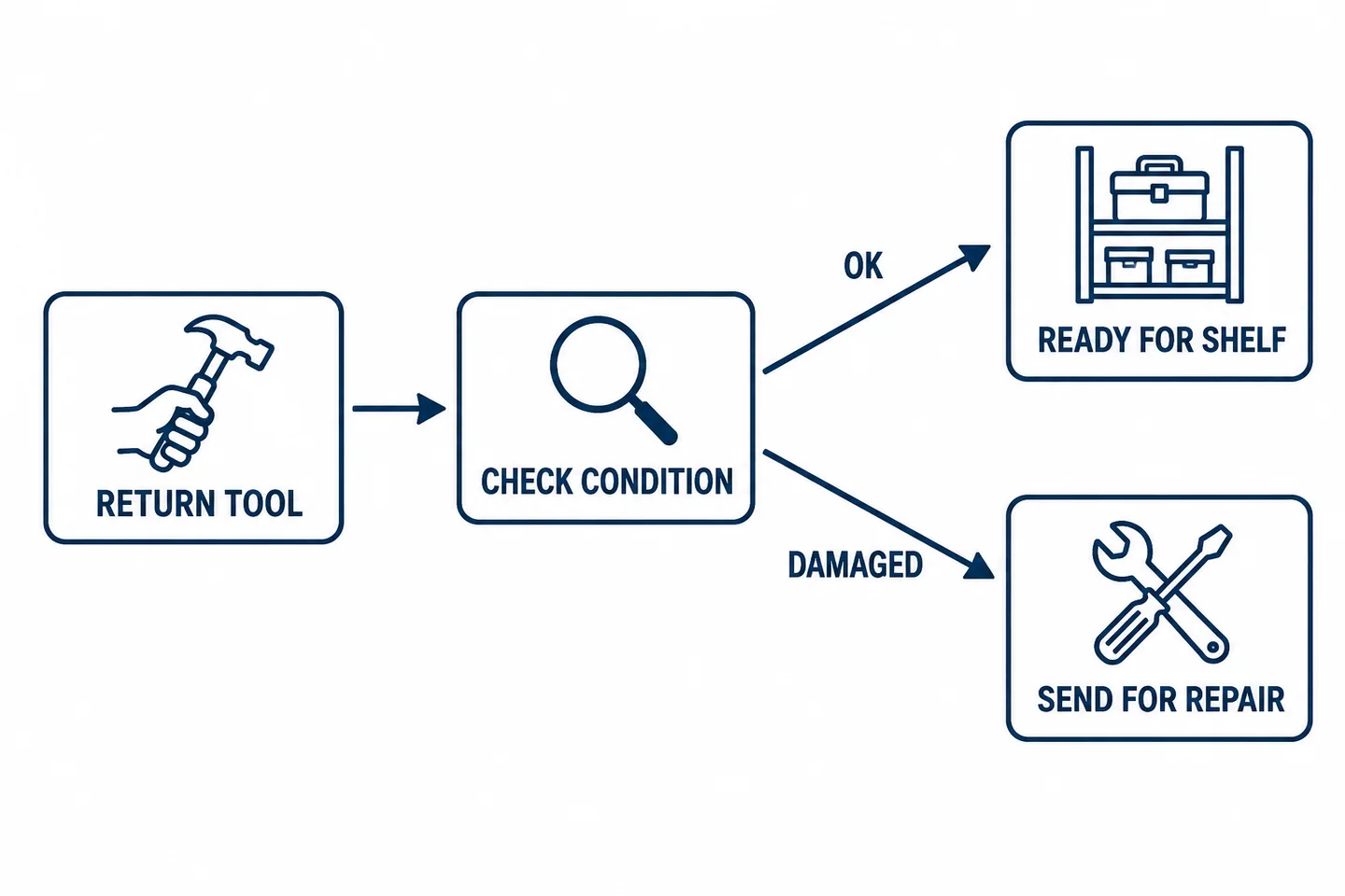
What this output shows: All four boxes are present. The condition check splits into the requested OK and DAMAGED routes, with no arrow joining repair back to the shelf. The connections, rather than the icons alone, make this result useful.
Review the result: Trace each route with a finger. Confirm that the repair branch never reconnects to the shelf without an explicit step. For a diagram that changes often, rebuild it in an editable diagram tool.
Compare a three-step visual sequence with its observed continuity error.
Posters and covers: decide who renders the words
Use generated lettering for a small, checkable block. For a changing date, long schedule, or responsive web headline, leave space and add ordinary text afterward. These are different briefs: one asks the image to contain words, while the other asks it to make room for them.
Read and copy the English prompt
Create a portrait announcement for a fictional ceramics open studio. Show one cobalt-blue bowl on a pale stone surface in the lower half. Use exactly two lines of text in the upper half: "OPEN WORKSHOP" and "SUNDAY, 11–4". Show each line once. Make the headline about twice the size of the date line, with plain dark sans-serif lettering and generous margins. Keep the bowl away from both lines. No studio name, address, price, decorative writing, logos, or watermarks. The announcement must remain readable on a phone.
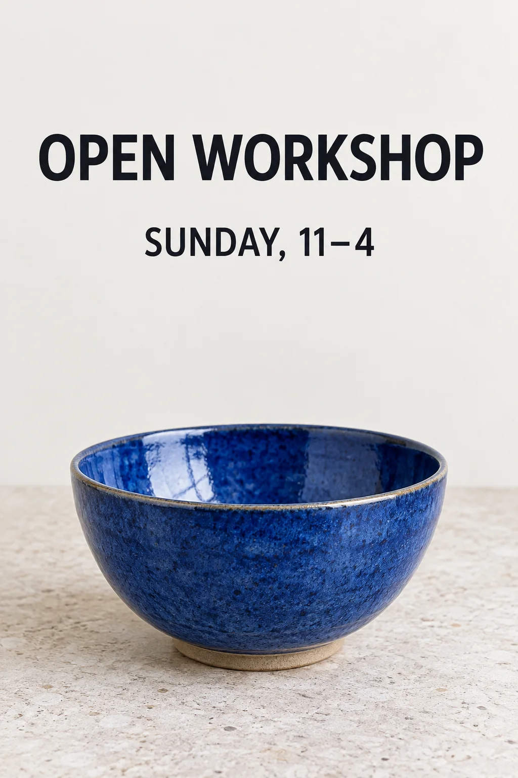
What this output shows: Both requested lines appear once, including the comma and dash in “SUNDAY, 11–4”. The bowl stays below the text. The headline is larger, although its letter height is less than twice the second line; treat the size instruction as an approximate hierarchy here.
Review the result: The punctuation in 11–4 matters as much as the large headline. Recheck after any later lighting or style edit, since those changes can also affect lettering.
Reusable marks: design for the smallest use
A mark that works on a large mockup may disappear in a small navigation bar. First explore a simple silhouette on a plain background. Choose one candidate, test it at small size and in one color, then rebuild the selected design as a vector if the final asset requires it. Ask for separate alternatives in separate requests so you can compare them fairly.
Read and copy the English prompt
Design one original symbol for a fictional repair collective called Loop & Mend, but do not render the name. Combine a single open loop with one short stitch-like stroke into a simple, balanced mark. Use solid navy shapes on a plain white background, equal margins, and no fine texture. Keep the design recognizable when reduced to a small app icon. No mockup, lettering, gradients, shadows, extra badges, or familiar brand symbols. Show one candidate only.

What this output shows: One open loop and one short stroke form a clear navy silhouette. The image contains no name or extra candidate. This delivered file is a raster on opaque white; it still needs small-size testing and vector reconstruction for a final brand asset.
Review the result: Inspect a small preview, a one-color version, and the silhouette against both light and dark surfaces. A generated raster is not an editable SVG, and a white background is not transparency.
Historical scenes: separate research from reconstruction
Use a short fact sheet to control the details a lesson depends on: place, period, clothing, equipment, and what should be excluded. Label the result as a reconstruction. A plausible period mood cannot confirm that a specific event, building, or person looked that way.
Read and copy the English prompt
Create an imagined historical reconstruction of a railway parcel office around 1920 for a classroom discussion. Show two clerks sorting plain paper-wrapped parcels on a wooden counter, with a mechanical weighing scale and shelves behind them. Use restrained documentary-style lighting and an eye-level view. Exclude digital screens, plastic shipping bags, barcodes, modern brand logos, and readable invented notices. This is an illustrative reconstruction, not a photograph of a documented event. Leave room below the image for a factual caption supplied separately.
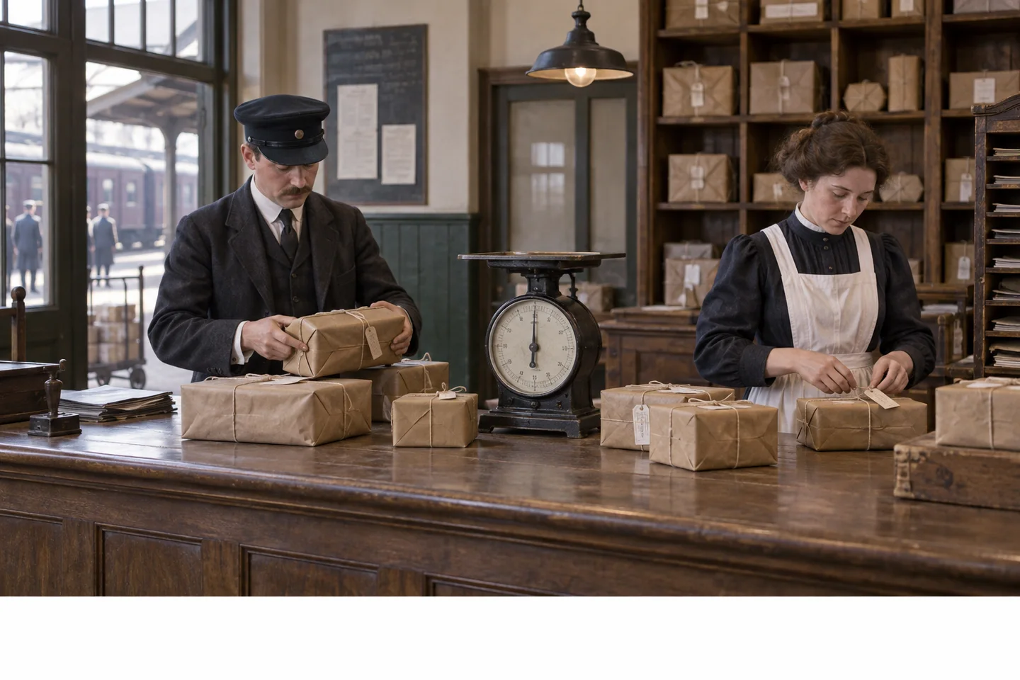
What this output shows: This is an imagined reconstruction, not an archival photograph. Two clerks, wrapped parcels, and a mechanical scale communicate the brief, but the image alone does not verify the period accuracy of their clothing or equipment. The blank strip below is available for a researched caption.
Review the result: Verify the objects and clothing against reliable period references before presenting the image as historically representative. Put the source notes and reconstruction label in the surrounding lesson text.
Comics and storyboards: write one visible beat per panel
A panel should show something a reader can see, rather than an abstract feeling or a whole paragraph of events. Define the reading order, recurring props, and a small character reference. If every panel must be precise, create approved frames separately and assemble the page afterward.
Read and copy the English prompt
Create a three-panel horizontal comic about a small coral-red delivery robot named Pip. Pip has two navy circular eyes on a pale square face screen, no mouth, navy boots, an ivory triangle on the chest, and a mustard satchel. Panel 1: Pip finds one plain brown parcel beside a closed greenhouse door. Panel 2: Pip lifts the same parcel with both hands as the greenhouse door opens. Panel 3: Pip places the parcel on a low potting bench inside. Keep the parcel size and robot design consistent. Use flat gouache illustration, clear panel borders, and a left-to-right reading order. No speech bubbles, written labels, duplicate robots, or extra parcels.
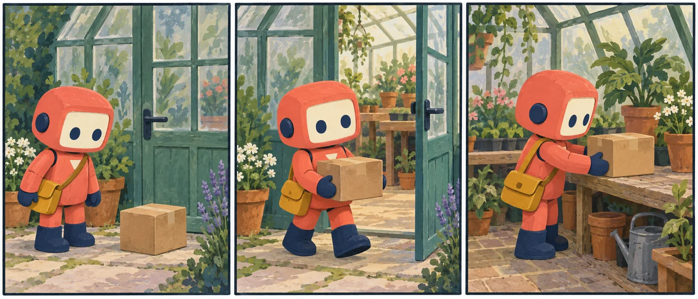
What this output shows: Each panel contains one robot and one parcel, and the door changes from closed to open before the indoor delivery. Pip remains recognizable. The parcel covers the chest mark in the last two panels, so those frames cannot verify every character detail.
Review the result: Count the parcel in every frame and check whether the door state follows the story. Do not confuse a pleasant character resemblance with an exact match.
See the character-reference workflow and its generated continuation.
Interface previews: describe a usable screen
Specify one screen and one state. Give the layout, real labels, and the action that should be obvious. A generated interface image is useful for discussing hierarchy, but it cannot demonstrate working controls, keyboard access, responsive behavior, or a real user flow.
Read and copy the English prompt
Create a straight-on mobile interface preview for a fictional neighborhood tool-sharing app. Show a reservation confirmation screen with the heading "Your drill is reserved", the pickup time "Saturday, 10:00 AM", a small drill thumbnail, and one primary button labeled "View pickup details". Below it place a quiet text link labeled "Cancel reservation". Use a near-black background, white text, neutral gray supporting text, rounded controls, and generous spacing. Make the pickup time easy to scan. Show the screen alone without a phone frame, hands, 3D perspective, marketing slogan, charts, or invented navigation items.
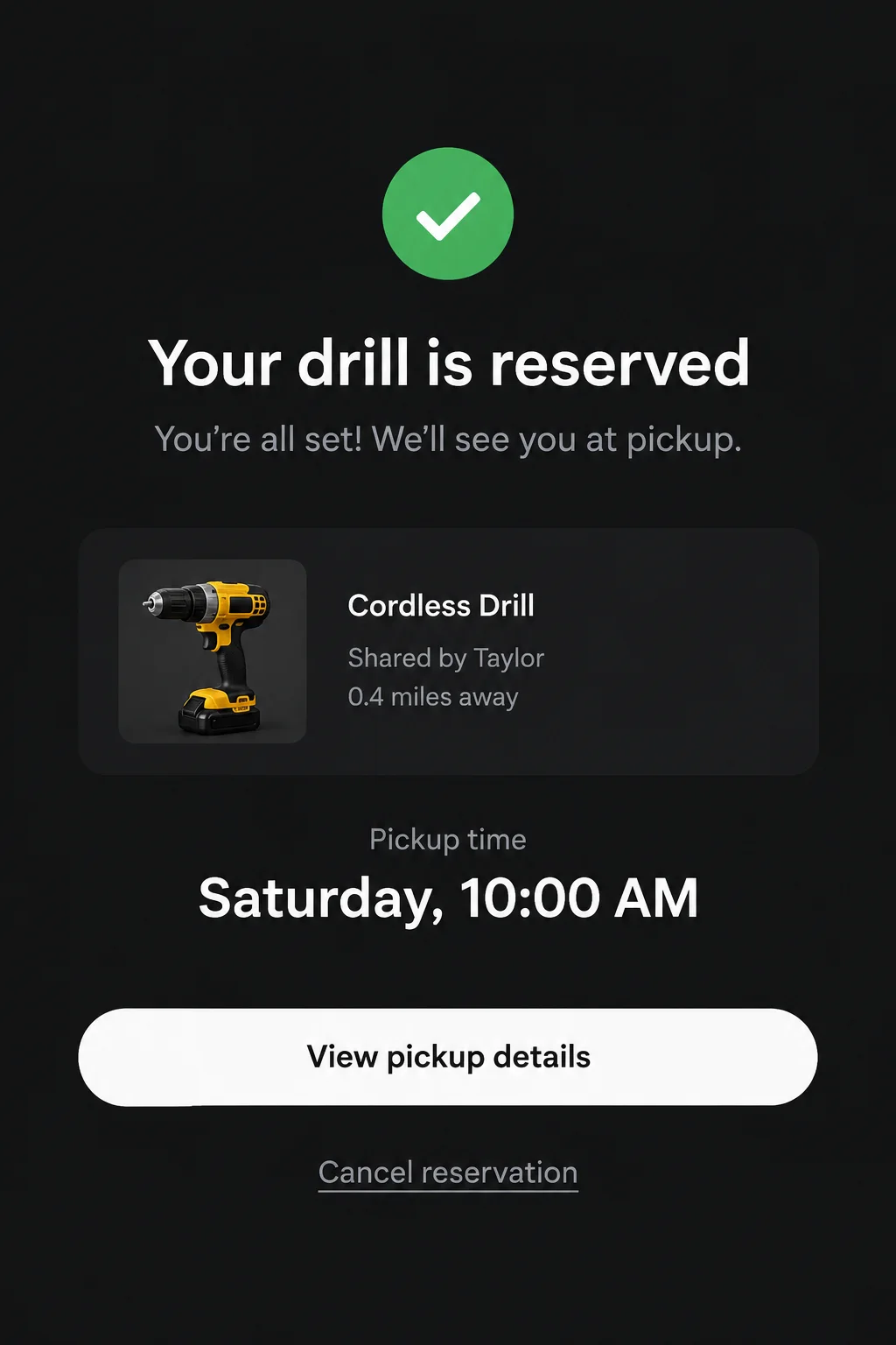
What this output shows: The four requested labels are legible and the white primary button dominates. The generator also invented a confirmation sentence, a lender name, and a distance. Supply an exhaustive allowed-copy list if those additions are unacceptable. This is a static image, not a working reservation screen.
Review the result: Read all labels, check which action dominates, and rebuild the screen in real UI code before evaluating usability. Tiny drawn buttons do not establish valid touch targets.
Educational visuals: supply the lesson and its limits
Keep the learning objective narrow. List the required parts and relationships, then check the result against the lesson notes. If a diagram uses symbolic shortcuts, explain them in its caption. Visual polish is not a substitute for subject review.
Read and copy the English prompt
Make a simple two-panel classroom diagram explaining an open and a closed circuit. In both panels show one battery, one switch, one small bulb, and connecting wires in the same positions. Left panel: label "OPEN CIRCUIT"; show a gap at the switch and an unlit bulb. Right panel: label "CLOSED CIRCUIT"; show the switch connected and the bulb lit. Label the components "Battery", "Switch", and "Bulb" once per panel. Use a flat, high-contrast visual style on white with large text. Do not include household sockets, extra branches, electron-flow arrows, or numerical claims. This is a conceptual diagram, not assembly instructions.
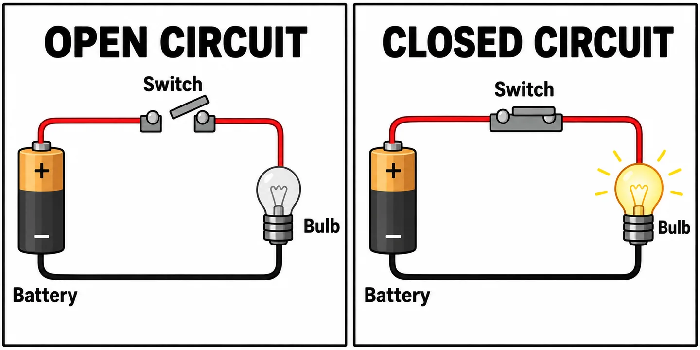
What this output shows: The open switch accompanies an unlit bulb; the closed switch accompanies a lit bulb, with the requested component labels in both panels. However, the top wire appears to enter the glass bulb rather than a distinct electrical contact. Redraw the connections with a teacher before using it to teach circuit construction.
Review the result: Check that the wires actually form the intended path, that the switch state matches the bulb state, and that no decorative line creates an unintended connection. Have the subject teacher review the final diagram.
Slides and charts: provide the data, then verify the geometry
Decide the single point the slide should communicate. Supply the numbers and labels explicitly. For a generated chart, audit both the printed values and the visual proportions. Use a spreadsheet or charting tool when accurate data encoding, future updates, or accessible data tables are essential.
Read and copy the English prompt
Design one landscape 16:9 presentation slide using fictional demonstration data. Title: "Repair sessions completed". Show three vertical bars for May: 8, June: 12, July: 10. Use a common zero baseline and a vertical axis labeled from 0 to 12 in steps of 2. The bar heights must represent 8, 12, and 10 on that scale. Print each value above its bar. Use navy bars on white, one restrained coral accent on June, and no 3D effects. Add the footnote "Illustrative data only" exactly once. No growth percentages, extra categories, sources, or invented statistics.
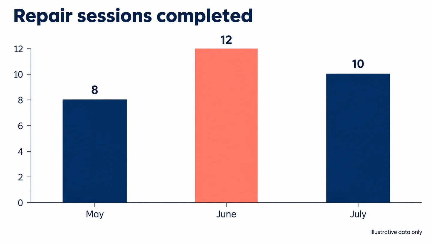
What this output shows: The values read May 8, June 12, and July 10. The bars meet the corresponding ticks on a shared zero baseline, and the fictional-data footnote appears once. This visual check supports this particular illustration; keep the underlying values in an accessible table for a real report.
Review the result: A June bar should be 1.5 times the height of May on this zero-based scale. If the shapes disagree with the numbers, reject the chart rather than trusting the labels.
Image editing prompts: define what can change
Use Edit image and upload the references in the order named in the prompt. Describe the intended change, the source of each borrowed detail, and the parts to protect. Match the reference crop to the task before generating; extra inputs are useful only when their roles are clear.
Jump to a task
Each of these eight English prompts was run with the labeled reference images shown below it. Compare those synthetic inputs with the edited result, then read the observed limitations. For two-reference edits, Image 1 and Image 2 identify the actual upload order.
Localize text without rebuilding the layout
Provide an approved replacement list and decide how much the type can shrink or reflow. A longer translation may not fit the original box. Preserve the image and layout first, then inspect every replacement and all text you did not intend to change.
Read and copy the English prompt
Edit the supplied poster to replace only these Spanish phrases with the approved English copy: "TALLER ABIERTO" becomes "OPEN WORKSHOP" and "ENTRADA LIBRE" becomes "FREE ENTRY". Keep all dates, numbers, illustrations, colors, margins, and text-box positions unchanged. Preserve the type style and hierarchy. If the replacement is wider, reduce its font size slightly within the existing box rather than moving other elements. Do not translate brand names or add any wording.
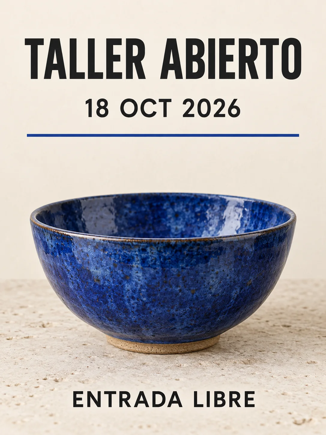
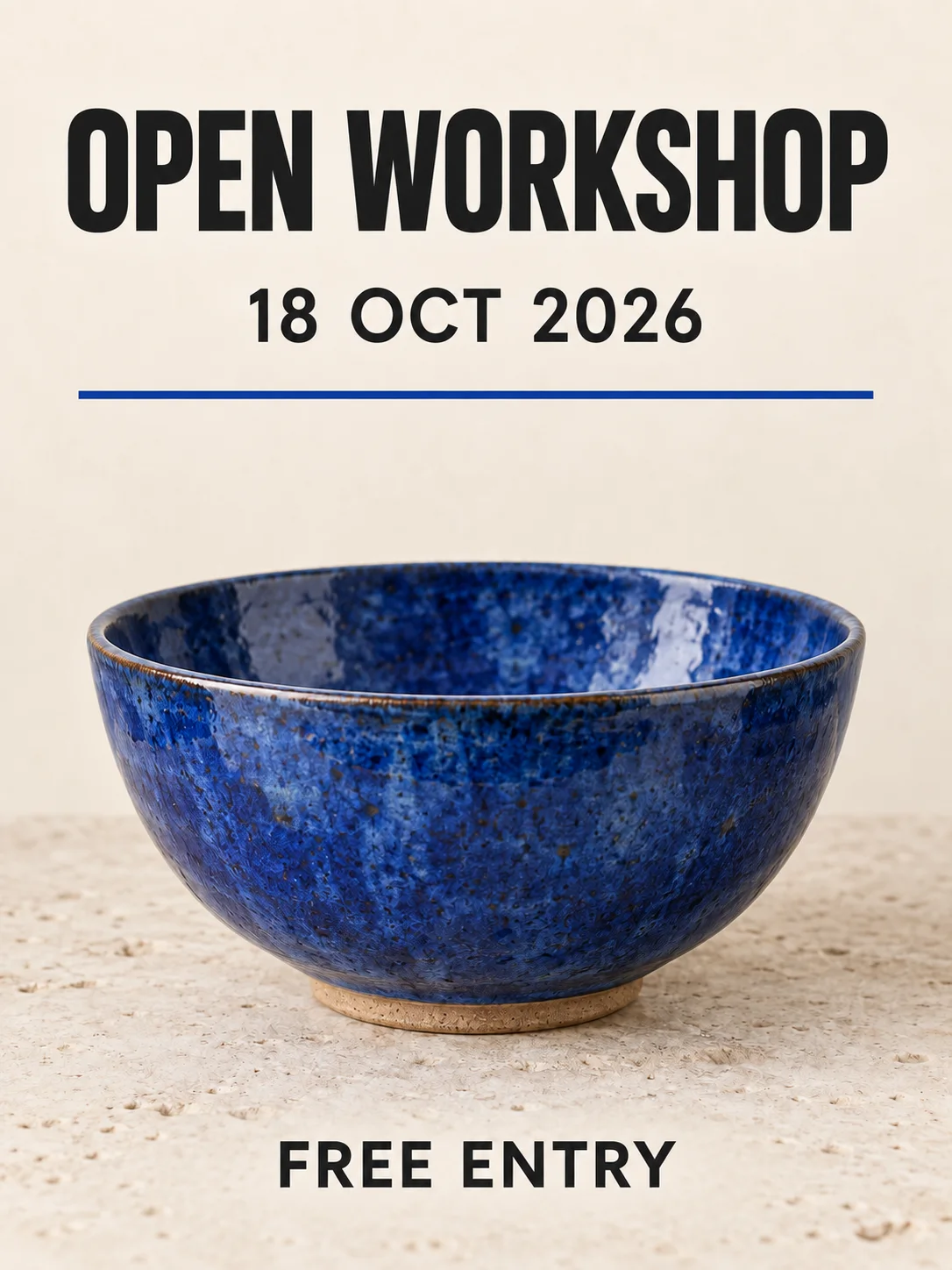
What this output shows: OPEN WORKSHOP and FREE ENTRY replace the two Spanish phrases while 18 OCT 2026 stays unchanged. The bowl and blue rule remain in the same layout. The longer headline uses narrower spacing; inspect it at its final display size.
Review the result: Compare numbers and dates separately from the translated copy. If fitting the text damages legibility, set the approved translation in a layout editor.
Borrow a visual treatment, not the reference subject
Separate image content from visual treatment. Tell the editor whether the reference supplies palette, stroke, texture, or lighting. A vague style request can import unwanted objects or change the composition.
Read and copy the English prompt
Use image 1 as the complete scene and image 2 only as a reference for its limited coral-and-navy palette, rough paper grain, and flat screen-print shading. Render the objects from image 1 with that treatment. Keep their count, silhouettes, positions, camera angle, and relative scale. Do not import any people, objects, lettering, borders, or composition from image 2. Keep important small features readable instead of filling them with texture.
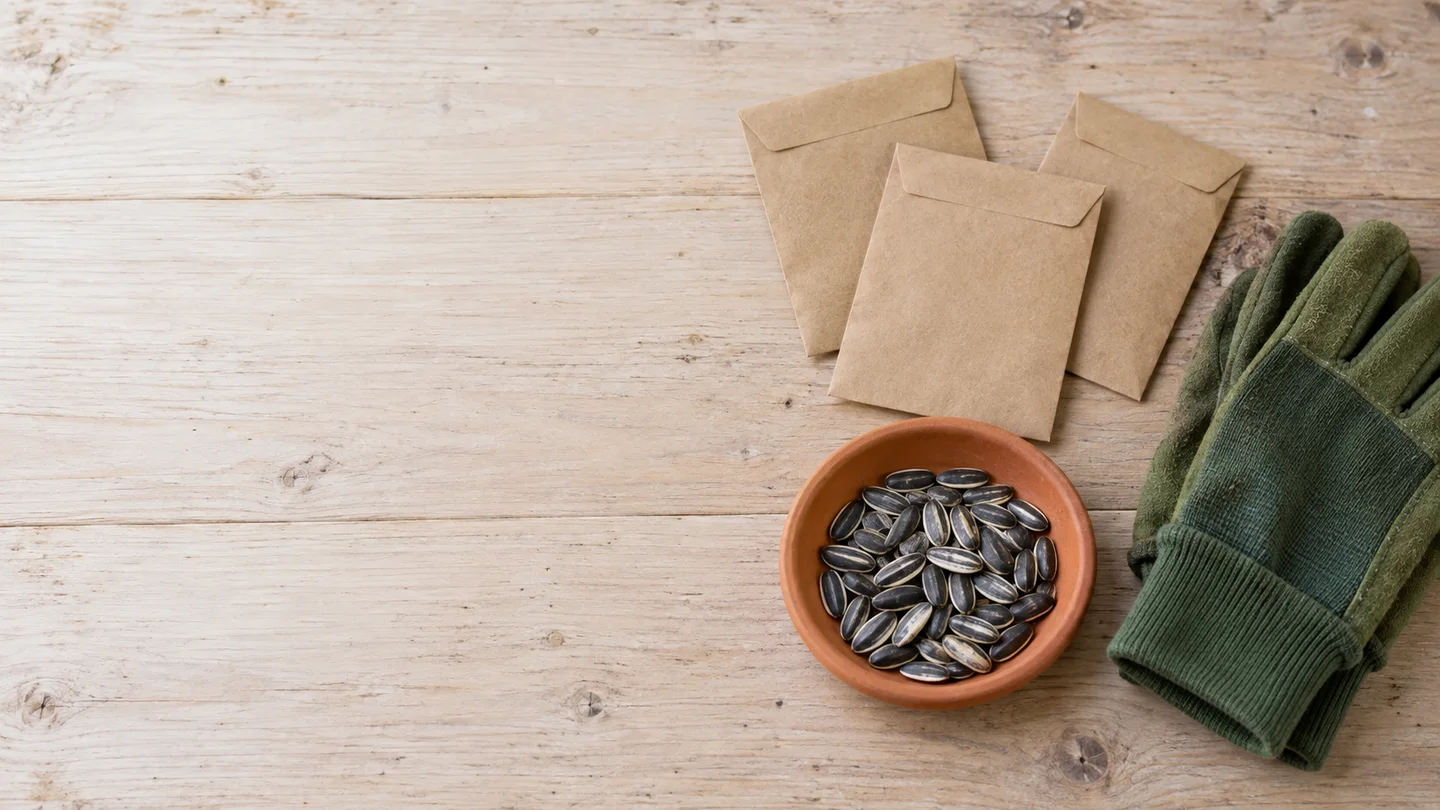
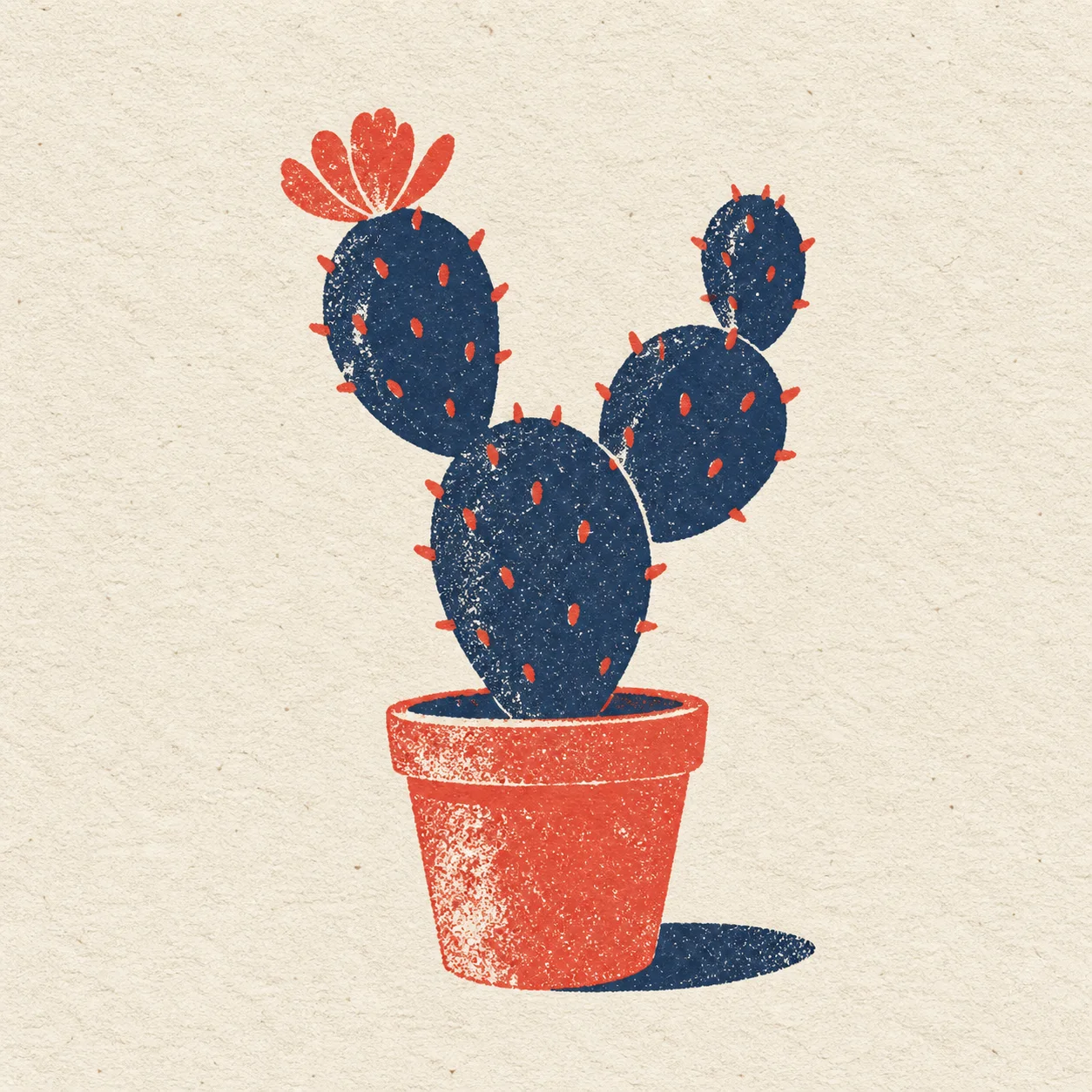
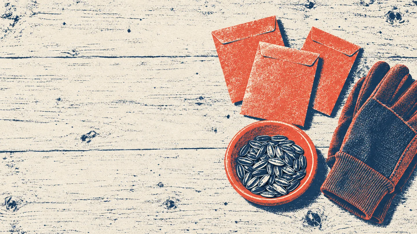
What this output shows: The three envelopes, seed dish, and gloves remain on the right, and no cactus is imported. Coral-and-navy texture changes the treatment successfully, but stronger grain also fills the reserved left area. Retest headline contrast before using this version as a newsletter cover.
Review the result: Check object identity and placement before judging the visual resemblance. If protected lettering changes, restore that lettering as a separate layer.
Change clothing while protecting the person
Choose a clear identity photo and a garment reference that shows the relevant shape. Specify fit, not just the garment name. Check fabric occlusion around hands and hair along with the face; a good likeness alone does not make a convincing clothing edit.
Read and copy the English prompt
Use image 1 as the person, pose, and scene reference. Use image 2 only for the design of a mustard raincoat. Replace the outer jacket in image 1 with that raincoat, fitted naturally to the existing shoulders, elbows, and posture. Keep the face, hairline, skin tone, body proportions, expression, hands, trousers, background, and framing. Keep the person’s existing pose. Match the coat’s light and folds to the scene. Do not add a hood over the face, accessories, lettering, or beauty retouching.
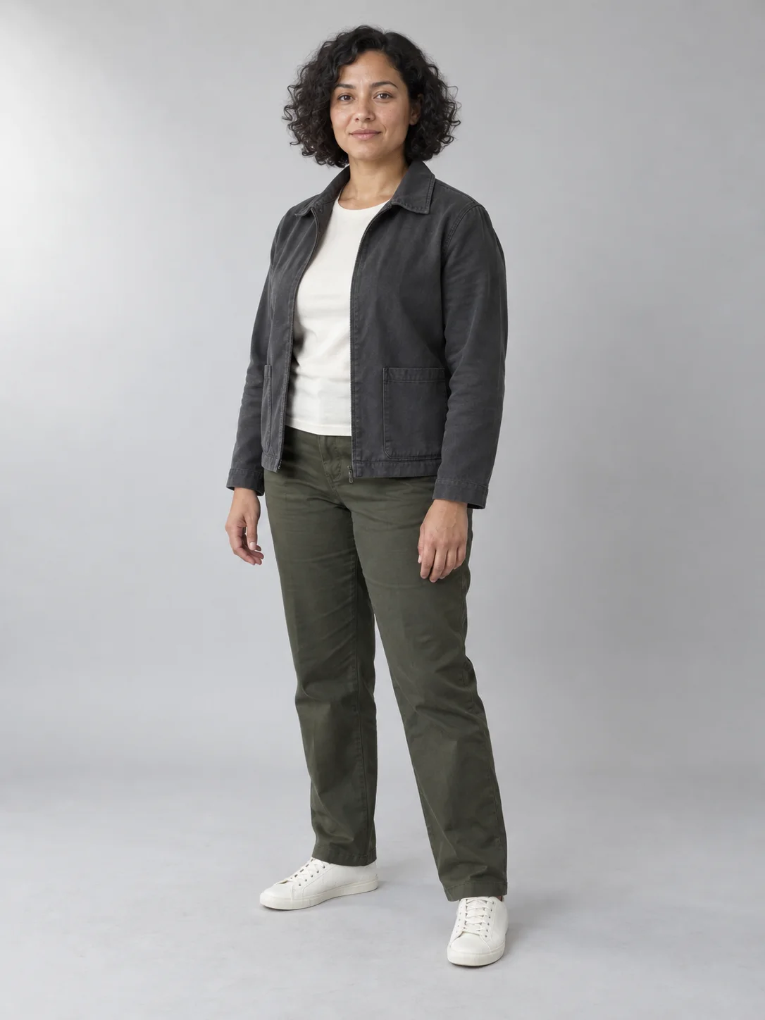
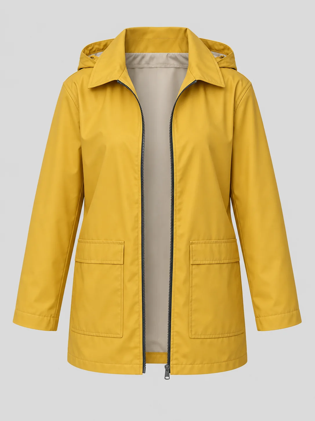
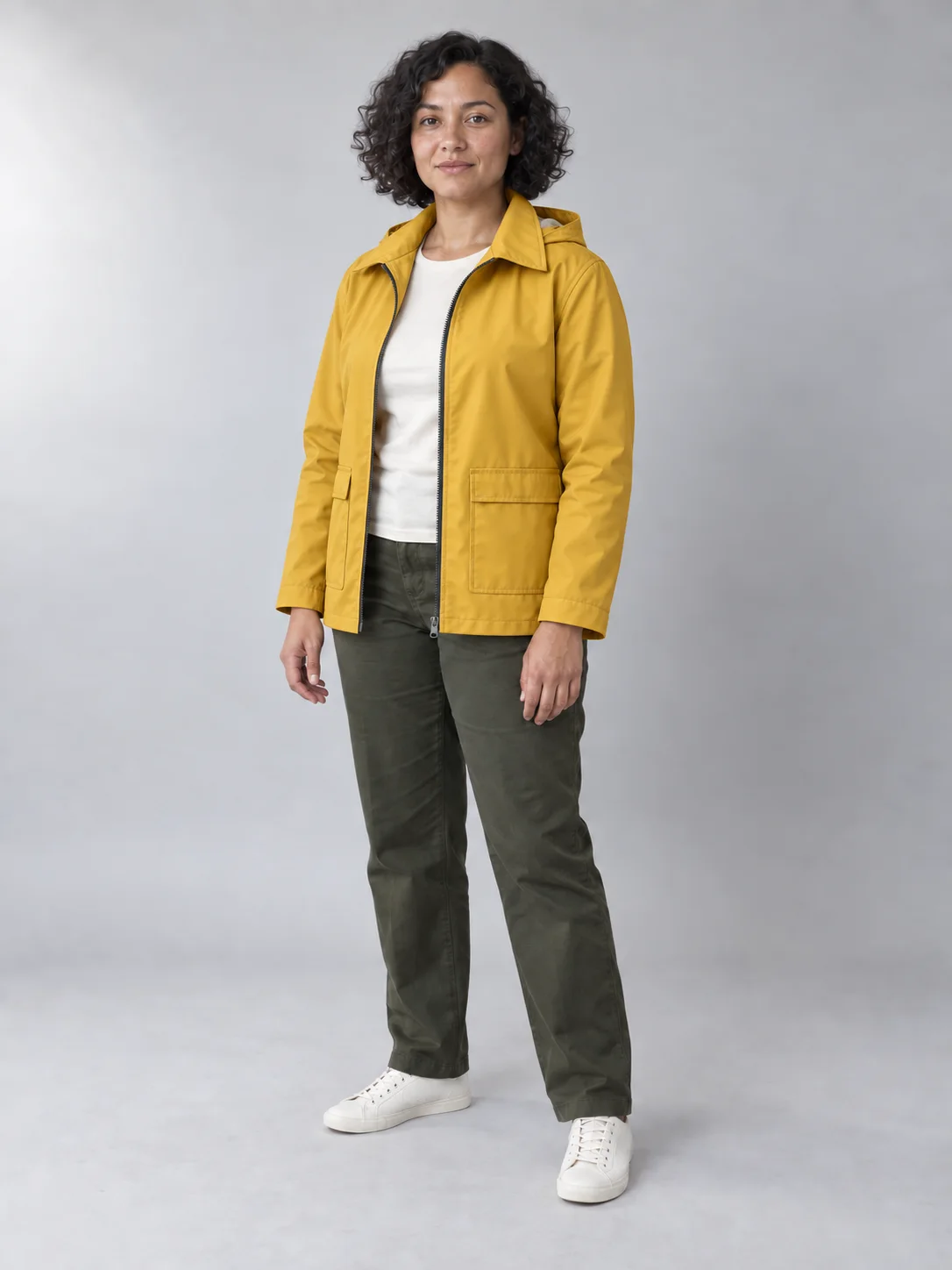
What this output shows: The mustard coat follows the existing pose, and the face, trousers, hands, and shoes remain visibly recognizable. The pocket construction is not an exact duplicate of the garment reference. Compare seams and trim as well as facial likeness before approving a clothing edit.
Review the result: Compare face shape, hairline, hands, and body outline against the source. Inspect where the new garment overlaps the neck and wrists. Treat preservation instructions as a target, not a guarantee.
Combine references with a placement plan
Give each input a single job. Name the insertion point, scale cue, overlap, and light source. If two references disagree about camera angle, choose which scene controls the final perspective.
Read and copy the English prompt
Use image 1 as the room and camera reference. Take only the small red reading chair from image 2 and place it in the empty alcove beside the window in image 1. Match its size to the existing side table and align its feet with the floor plane. Match the room’s daylight and add a natural contact shadow beneath the chair. Preserve the walls, window divisions, table, books, floorboards, crop, and all other furniture. Do not copy the background of image 2 or duplicate the chair.
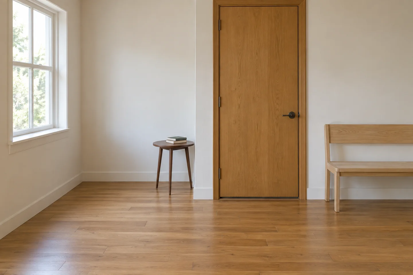
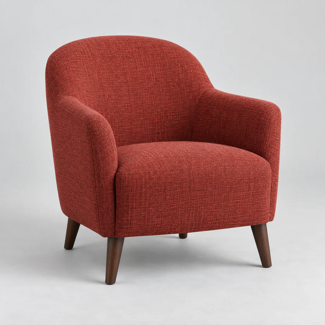
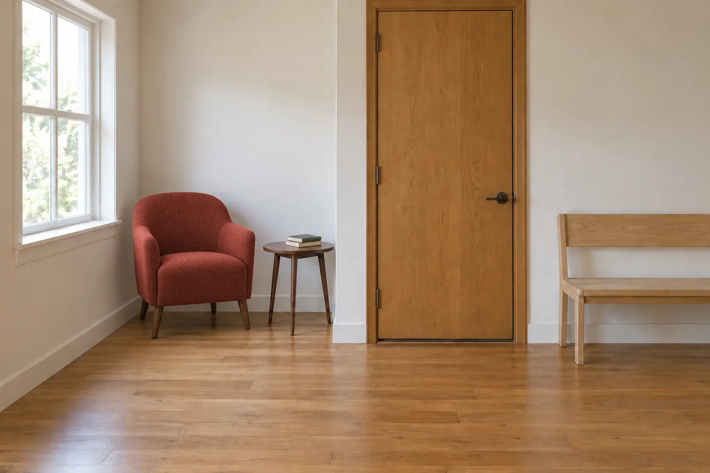
What this output shows: One red chair fills the window alcove beside the table. The two books, bench, and door remain visible, and the chair has contact shadows at the floor. Its leg proportions differ from the product reference, so this is a placement concept rather than proof of exact furniture fidelity.
Review the result: Inspect the chair feet, scale, overlap, and shadow. Count the original furniture again to catch accidental replacements.
Product cutouts: distinguish isolation from alpha
An isolated object on white is a useful draft, but it is not a transparent asset. The current website has no explicit transparency control. You can describe the desired cutout, then inspect the downloaded file in an editor; choosing PNG alone does not guarantee an alpha channel with transparent pixels.
Read and copy the English prompt
Isolate the ceramic vase from the supplied photograph. Preserve its outer contour, open mouth, glaze pattern, proportions, and camera view. Remove the surroundings and request a fully transparent background, including the empty space through its handle. Keep clean edges without a pale fringe. Add no floor, drop shadow, solid background, checkerboard pattern, lettering, or new surface decoration. Do not redraw the vase as a different product.
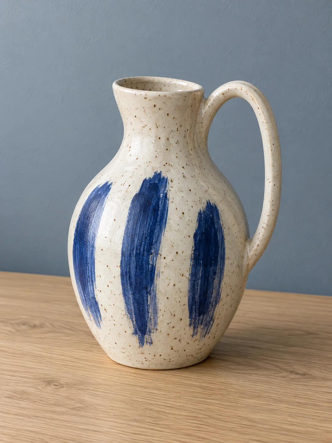
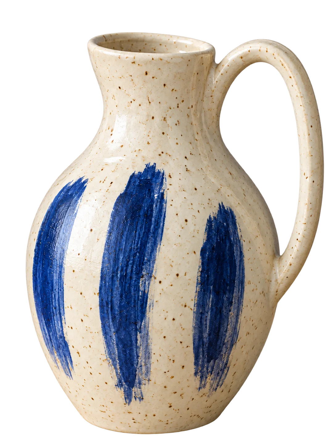
What this output shows: The downloaded WebP contains transparent pixels in the surrounding background and handle opening. The glaze marks remain recognizable, but the vase is enlarged within the canvas and some edges are rough at full size. Inspect those edges over both light and dark backgrounds before delivery.
Review the result: Place the downloaded file over light and dark layers in an editor. Check the handle opening and edge fringe. If the background is opaque, complete the cutout in that editor and export verified transparency.
Sketches: resolve materials without moving the design
Separate fixed design decisions from unfinished areas. A sketch may leave a junction or depth ambiguous; name the intended construction rather than asking the model to invent it. Use the result to explore appearance, then return to measured drawings for dimensions.
Read and copy the English prompt
Turn the supplied desk sketch into a realistic furniture concept. Keep the desktop outline, two drawer positions, leg angles, camera perspective, and proportions from the drawing. Use pale ash wood for the top and drawers, matte dark-gray steel for the legs, and soft daylight on a plain studio background. Interpret the sketch’s central gap as open space, not another drawer. Add no handles, shelves, cables, plants, measurements, or lettering that are absent from the drawing.
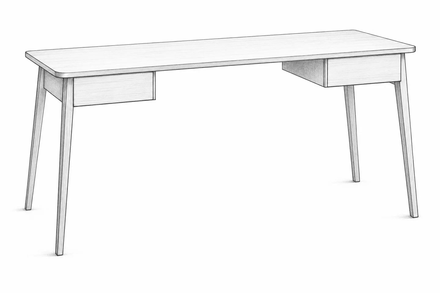
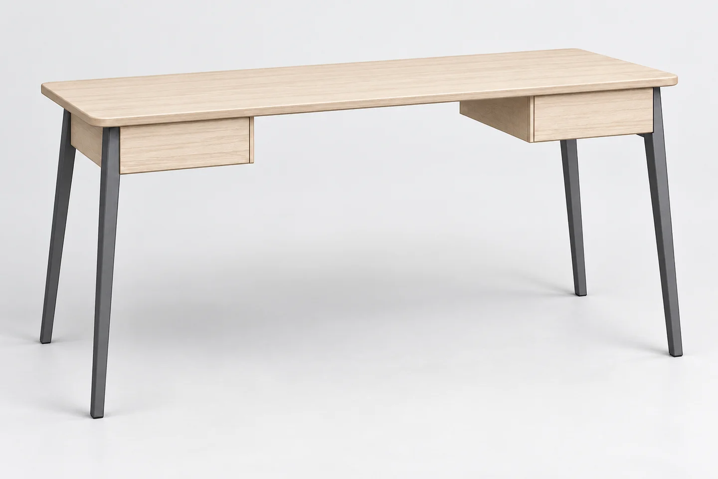
What this output shows: The result keeps two drawers, four legs, and the central opening while adding pale wood and dark metal. The camera view follows the sketch closely. This comparison establishes visual continuity, not manufacturing dimensions.
Review the result: Overlay or compare the sketch at the same scale. Count drawers and legs, inspect negative space, and do not infer manufacturing dimensions from the render.
Remove an object and inspect the reconstruction
Name the item and the area it occupies. The editor has to invent what was hidden behind it, so focus your review on repeated textures, broken edges, and shadows that no longer have an owner.
Read and copy the English prompt
Remove only the loose black charging cable crossing the front of the wooden desk in the supplied image. Reconstruct the wood grain beneath that cable so it follows the surrounding grain direction. Preserve the laptop, books, mug, their shadows, the desk edge, camera angle, exposure, and crop. Keep any cables that do not cross the front of the desk. Add no objects and do not smooth or recolor the whole surface.
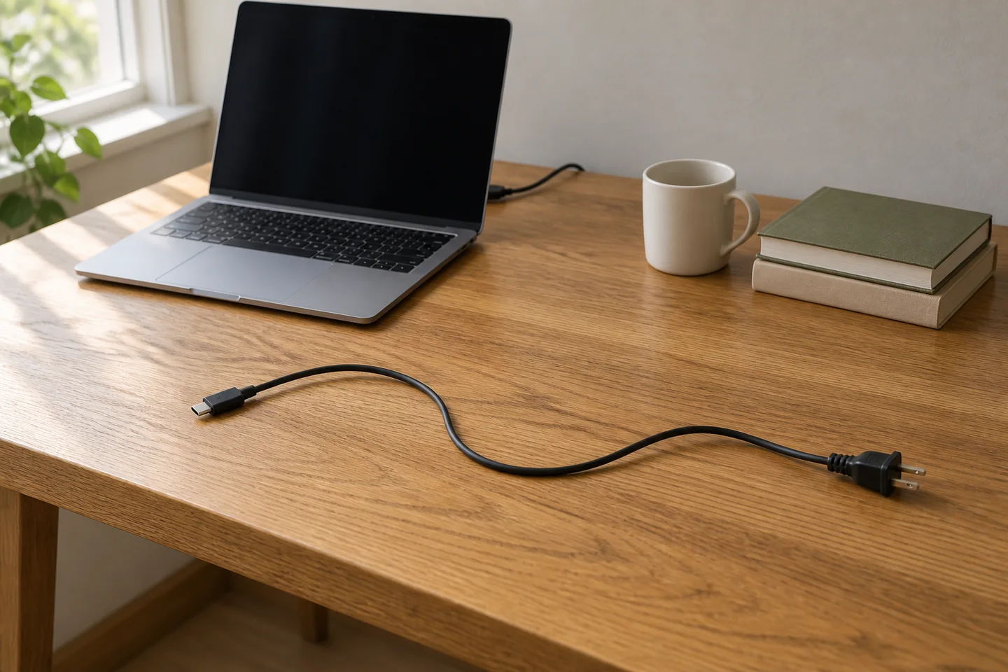
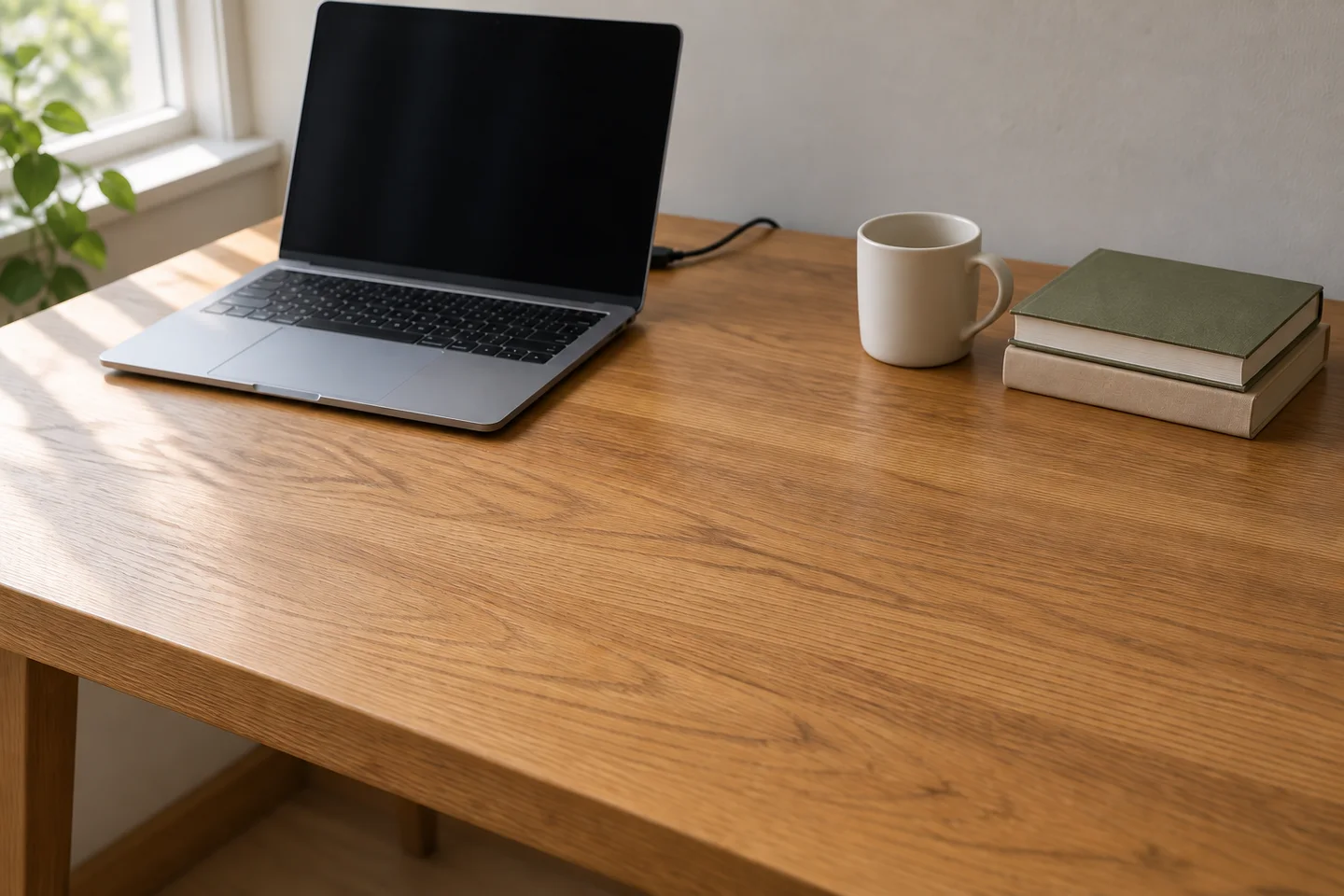
What this output shows: The loose front cable is removed while the separate cable behind the laptop remains. The mug, two books, and desk edge are still present. Follow the exposed wood grain across the removed area at full size to judge the reconstruction.
Review the result: Follow the reconstructed grain and desk edge across the edited area. Check that the mug shadow and any intentionally retained cables remain intact.
Place a person into a new setting
Decide whether the pose should stay or change. Preserving a full-body pose while supplying a new background is easier to evaluate than simultaneously changing outfit, expression, viewpoint, and action. Match scale and ground contact before adding atmospheric effects.
Read and copy the English prompt
Use image 1 as the person reference and image 2 as the setting reference. Place the person from image 1 standing beside the entrance bench in image 2. Preserve their face, expression, hairstyle, clothing, body proportions, and standing pose. Keep the full body visible and scale the person naturally against the door. Match the setting’s soft daylight and create a plausible shadow at the feet. Keep the architecture and bench from image 2. Add no other people, new accessories, lettering, or dramatic color effects.
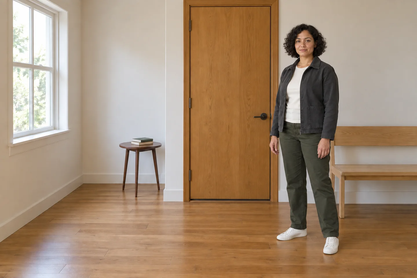
What this output shows: The full figure appears beside the bench with recognizable clothing and a floor shadow. However, the door and side table shift left relative to the room reference. This first result misses the protected-architecture requirement; use a stricter local edit before treating the composite as an unchanged setting.
Review the result: Compare the face and clothing with image 1, and the architecture with image 2. Check feet and ground contact; a floating subject can look convincing in a tightly cropped preview.
Five illustrated cases: read the prompt, inspect the output
These original cases put the method into practice. Each includes the exact English prompt, a generated output, an acceptance checklist, and a suggested repair. The suggested repairs in these five cases were not executed. The separate refinement sequences include actual generated edits. Single examples do not establish a success rate.
A newsletter cover with room for a real headline
A community seed-swap newsletter needs an image behind live HTML text. The useful feature is a quiet text area, not lettering generated into the picture.
Text to image · Suggested browser setup: 16:9 · Medium · 1K for the first layout check
Copy the English prompt
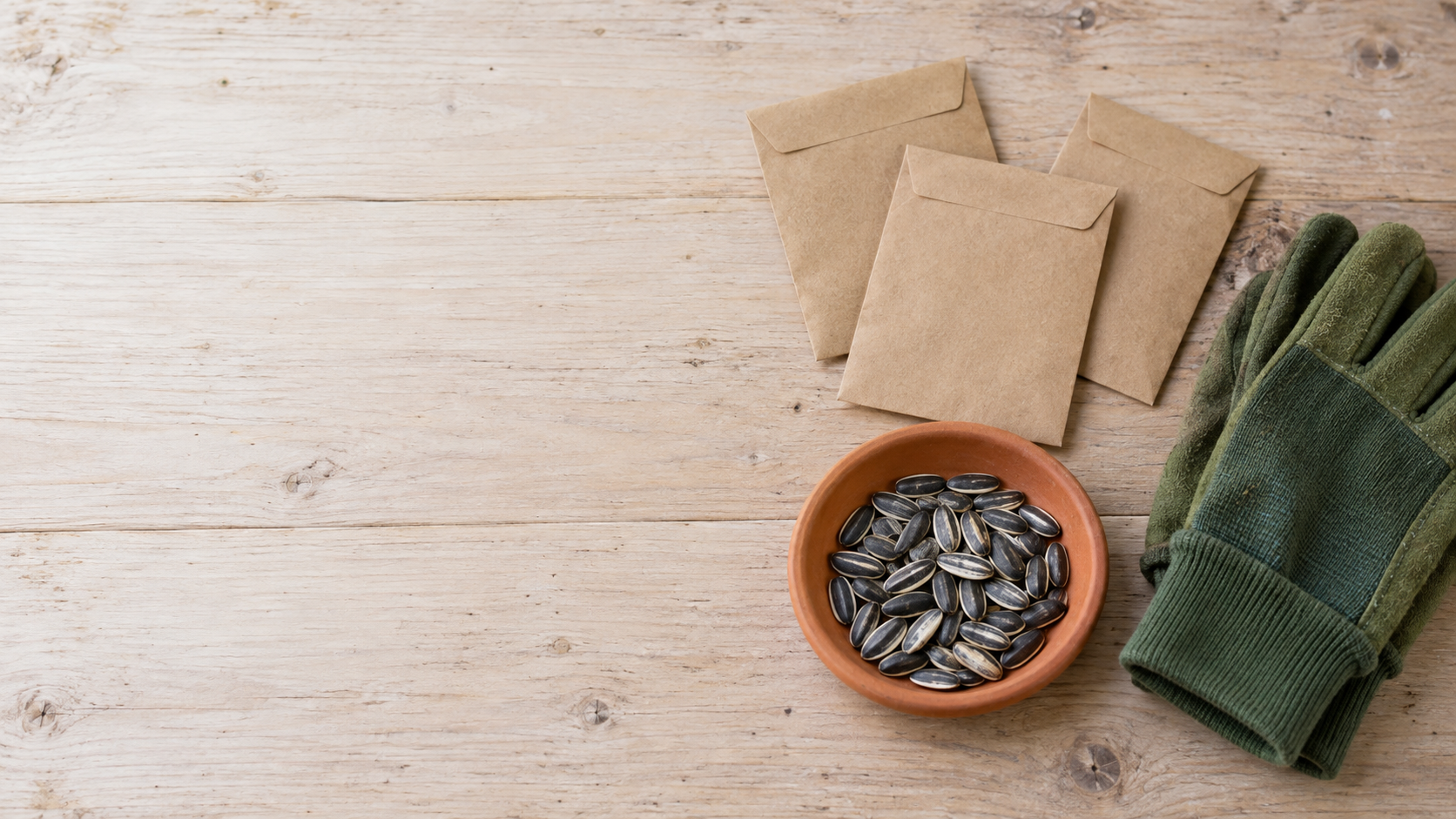
Create a landscape photograph for a neighborhood seed-swap newsletter. On the right third of a pale wooden workbench, show three small kraft-paper seed envelopes, a terracotta saucer containing sunflower seeds, and one pair of closed green gardening gloves. Photograph from slightly above with soft overcast daylight. Keep the entire left half as an uncluttered, evenly lit pale tabletop with subtle wood grain so a dark headline can be added later. All objects must stay inside the right half. Natural used materials, restrained colors, no decorative border. No words, logos, readable packet labels, people, or extra tools. Landscape 16:9 aspect ratio.
Check before accepting
- The left half is genuinely empty, including shadows and scattered seeds.
- Exactly three envelopes and one pair of gloves are visible.
- A dark headline remains readable when overlaid at the intended mobile size.
What this output shows. The generated image leaves a usable pale area on the left, shows three envelopes, and contains no lettering. The gloves are cropped at the right edge. That is acceptable for some covers; if the entire pair matters, add an explicit margin requirement. Test your real headline over this image before approving the layout.
Suggested repair prompt
Move the seed envelopes, saucer, and gloves into the right third. Remove every object and strong shadow from the left half. Preserve the existing materials, camera angle, and daylight. Add no text.
Place your actual headline over the draft before approving it. An image can look balanced by itself yet fail once a two-line headline is added. If the text area is too busy, fix placement before spending on a larger render.
An event poster with a small, checkable text block
A fictional repair event needs a poster that works as a phone-screen announcement. Restrict the content to three lines so every word can be checked.
Text to image · Suggested browser setup: 3:4 · Medium · 1K for the first text check
Copy the English prompt
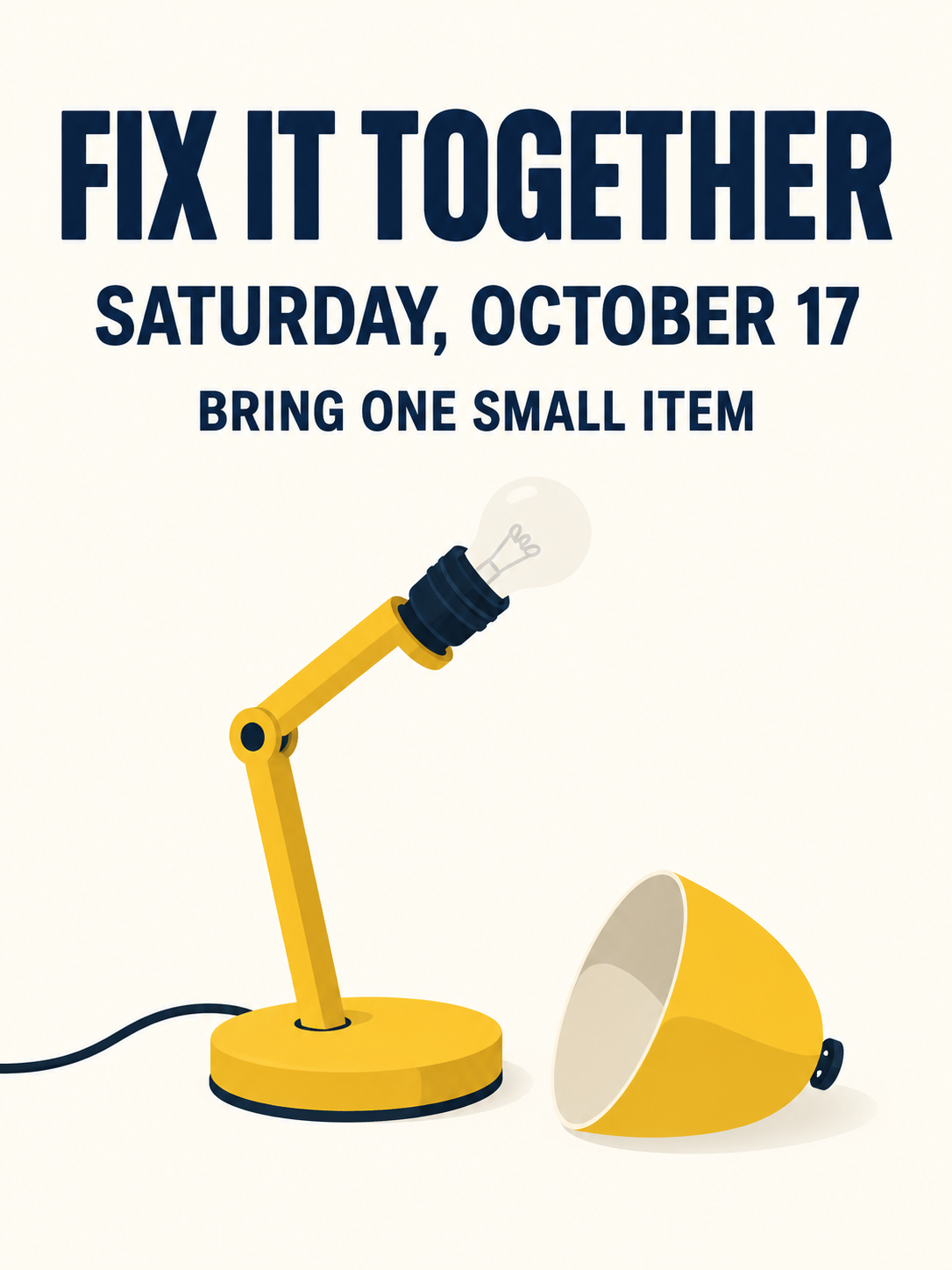
Design a portrait poster for a fictional neighborhood repair event. Use a warm white background, dark navy lettering, and a simple flat illustration of a yellow desk lamp with its detached shade resting beside it. Put the illustration in the lower half. In the upper half, include exactly these three lines in this order: "FIX IT TOGETHER"; "SATURDAY, OCTOBER 17"; "BRING ONE SMALL ITEM". Make the first line largest, the date second, and the final line smaller but clearly legible. Use generous margins, plain sans-serif lettering, and strong contrast. No other text, logos, prices, addresses, tiny decorative writing, or repeated headlines. Portrait 3:4 aspect ratio.
Check before accepting
- All three lines match the supplied words, punctuation, and order.
- There is one lamp and one detached shade, with no implied extra lamp.
- The last line can be read at normal phone viewing size.
What this output shows. The three requested text strings are present and visually legible in the original. The detached shade sits beside one lamp. This is a successful single illustration, not a text-accuracy rate; inspect substituted dates and names again in your own output.
Suggested repair prompt
Replace only the date line with "SATURDAY, OCTOBER 17". Keep the headline, final line, illustration, background, margins, and alignment unchanged. Do not add any new text.
The event details are invented for this example. Substitute your real details before use. For a final poster with essential contact details or a long schedule, add those in a layout editor after choosing the image; a convincing appearance does not verify the words.
A product backdrop change with a protected silhouette
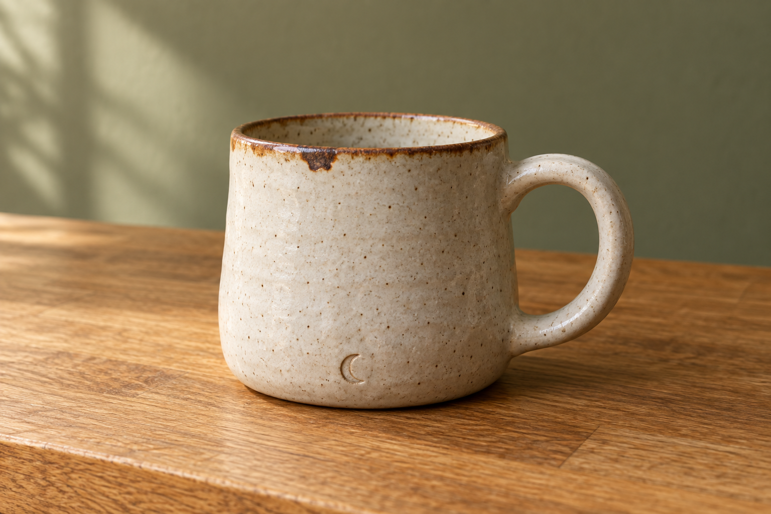
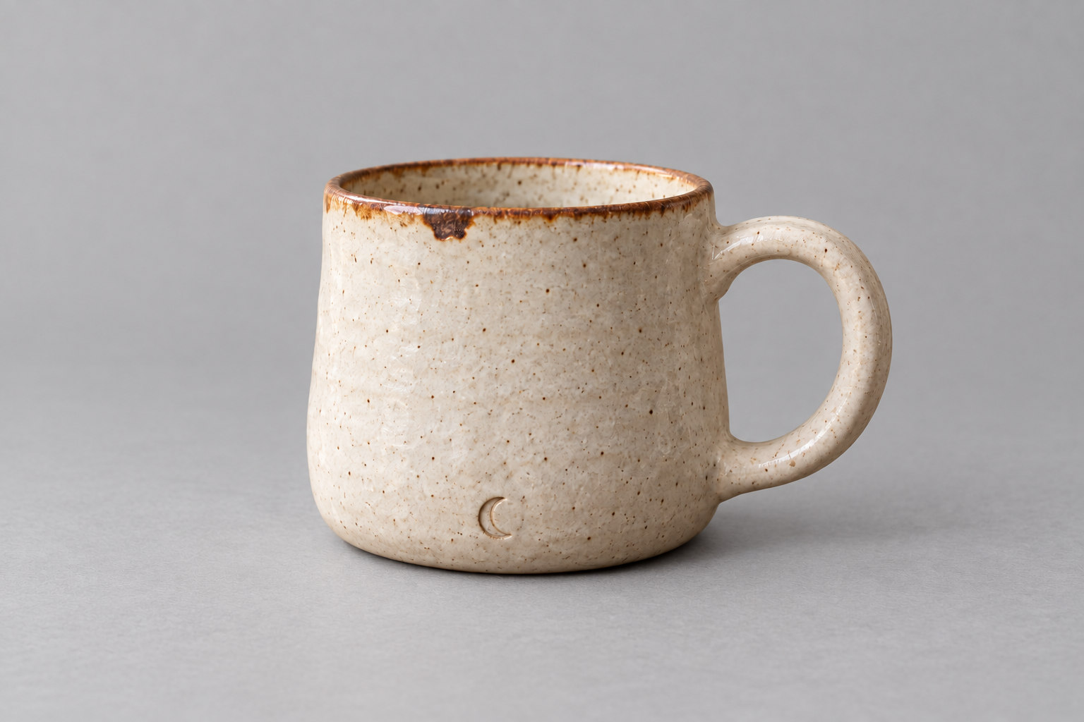
A maker wants a new backdrop for a handmade mug. The mug must still represent the photographed item. Use your own clear product photograph as the reference.
Edit image · Suggested browser setup: Upload one mug photo · Auto aspect ratio · Medium · 1K
Copy the English prompt
Edit the supplied photo of a handmade ceramic mug. Replace only the background and the surface beneath the mug with a matte light-gray studio backdrop and matching tabletop. Use soft diffuse lighting with a short contact shadow directly below the base. Keep the mug's outline, handle opening, rim shape, glaze color, speckles, visible maker's mark, camera angle, scale, and crop unchanged. Keep exactly one mug. Do not smooth away glaze irregularities, straighten an uneven rim, fill the handle opening, add steam, add lettering, or invent accessories.
Check before accepting
- The handle opening and outer contour match the source at the same viewing scale.
- Distinct glaze marks and the rim remain in the same places.
- The new shadow touches the base without changing the mug’s apparent shape.
What this output shows. The backdrop changes to gray while the handle opening, dark rim patch, and crescent mark remain recognizable. Lighting across the ceramic also changes, which was requested. This side-by-side view does not establish pixel-identical speckles or geometry; compare the originals before calling a product edit exact.
Suggested repair prompt
Return to the original mug photo. Change only the background to matte light gray. Preserve the mug pixels and its existing lighting as closely as possible; do not redesign or retouch the ceramic surface.
That last instruction is a request, not a guarantee of pixel preservation. If the mug’s shape or markings change, reject that version. For a catalog image that must be exact, retain the original object layer in a conventional photo editor and replace the background there.
A room concept that changes the rug, not the architecture
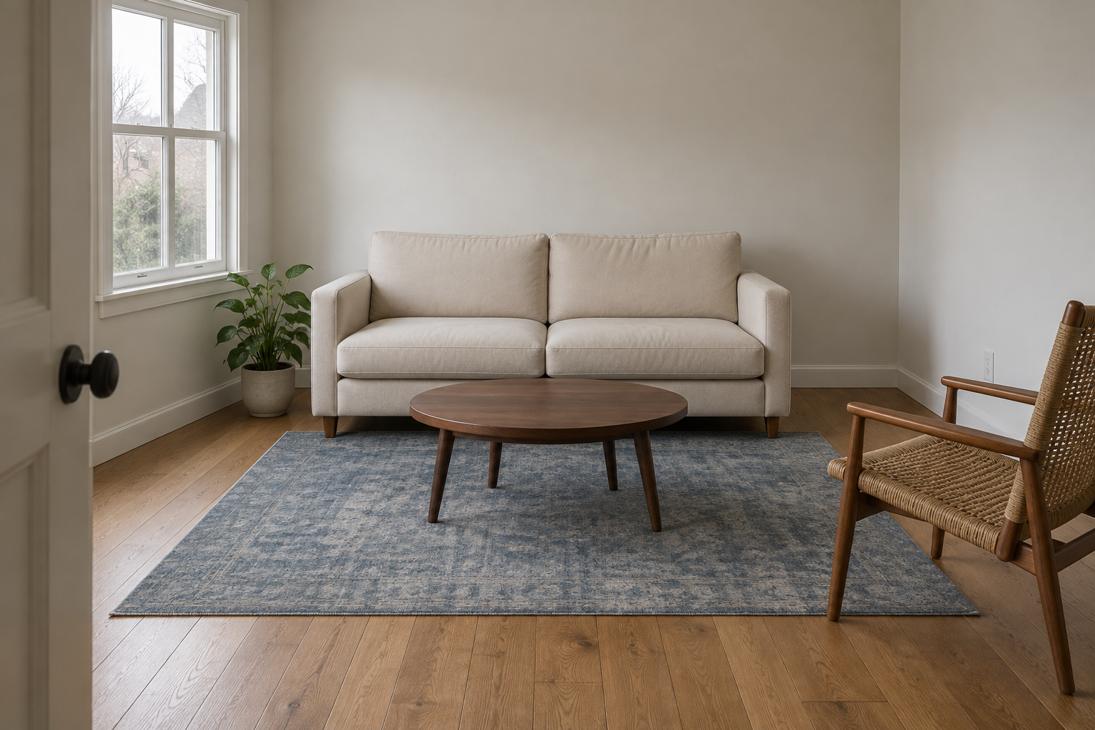
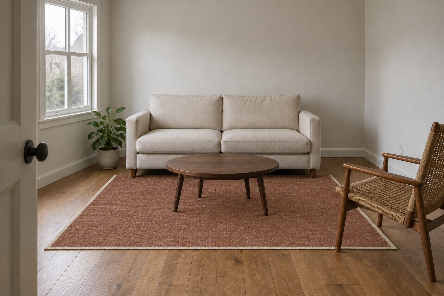
A renter wants to compare a rug idea without accidentally evaluating a different room. Choose a photo where the rug boundary and furniture feet are visible.
Edit image · Suggested browser setup: Upload one room photo · Auto aspect ratio · Medium · 1K
Copy the English prompt
In the supplied living-room photo, replace only the existing rug with a muted rust-colored flatweave rug with a narrow ivory border. Keep its footprint, perspective, and position under the furniture the same as the original. Preserve all windows and window divisions, walls, floorboards, sofa dimensions, chair legs, outlets, plants, objects on tables, camera angle, and daylight. Keep the rug edges correctly hidden where furniture overlaps them. No added furniture, changed wall colors, altered room proportions, new decor, or expanded floor area.
Check before accepting
- Window divisions, wall corners, and floorboard lines still match the source.
- Each furniture foot overlaps the rug in the same position.
- The rug has the original footprint; the room has not become wider.
What this output shows. The edit changes the blue rug to rust and adds an ivory border. The window divisions, sofa, plant, table, and outlet remain visibly in place at this viewing size. Treat that as visual preservation in this example, not a measured guarantee that every architectural detail is unchanged.
Suggested repair prompt
Use the original room photo again. Replace the rug color and woven texture only inside its existing boundary. Leave the ivory border narrow. Do not change any furniture, windows, walls, floorboards, or lighting.
Treat this as a visual concept, not a measurement or product-color proof. Screen color, lighting, and the generated weave can differ from a physical rug. Compare a real sample before making a purchase decision.
A three-frame recipe sequence with persistent objects
A food newsletter needs a simple visual sequence for mixing a lemon dressing. The challenge is continuity across frames, so define what stays present before describing the action.
Text to image · Suggested browser setup: 3:2 · Medium · 1K for the first sequence check
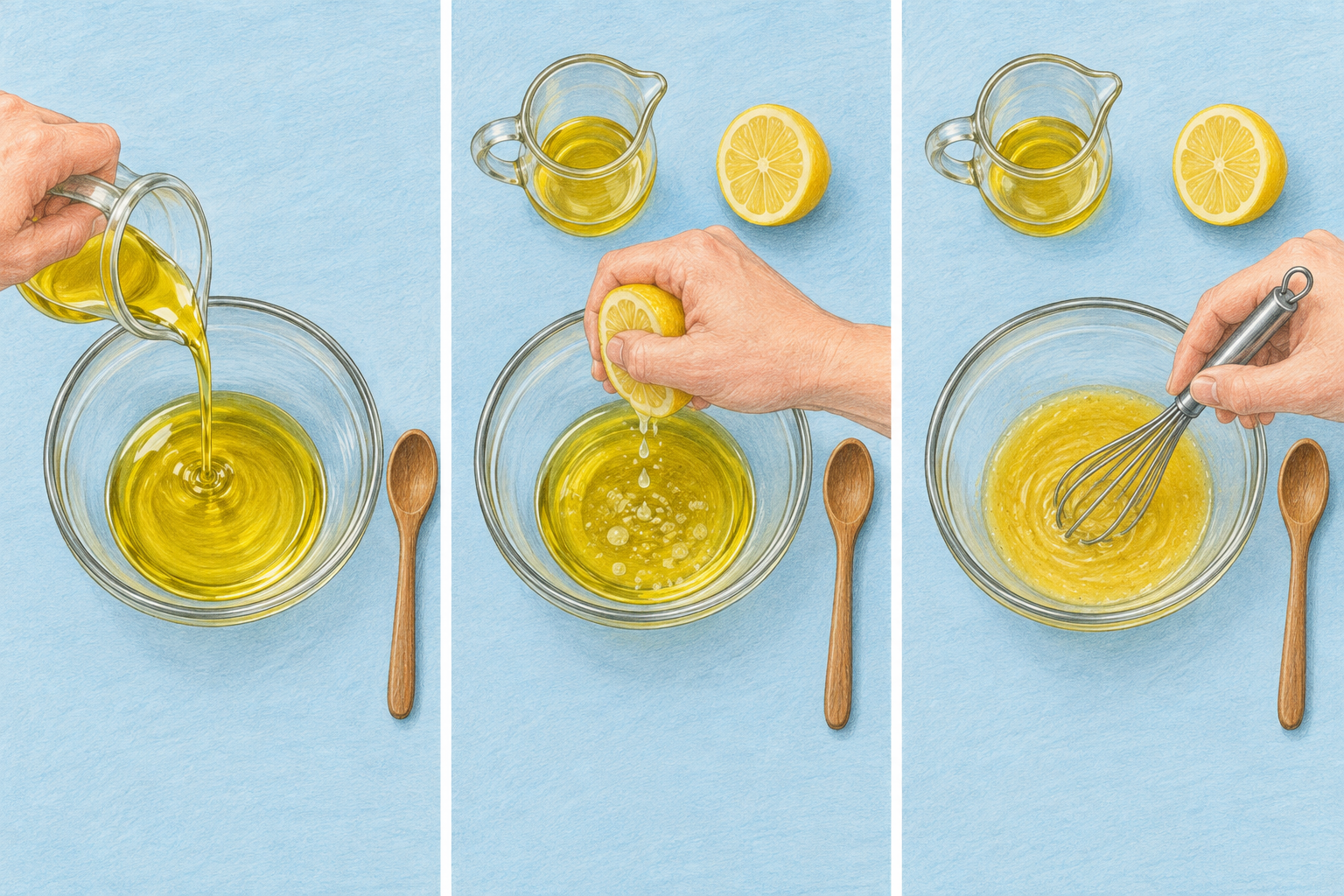
Copy the English prompt
Create a single landscape illustration divided into three equal vertical panels with thin white gaps. Show the same overhead view of the same round glass bowl on a pale blue tabletop in every panel. Keep one small wooden spoon to the right of the bowl throughout. Panel 1: a hand pours pale golden oil from a small clear jug into the bowl. Panel 2: the jug now rests above the bowl and a hand squeezes one lemon half over the oil. Panel 3: the jug and lemon half rest above the bowl while a hand uses a small metal whisk to mix the dressing. The wooden spoon stays unused at the right in all three panels. Clean colored-pencil illustration, consistent bowl size, consistent tabletop color, no labels, arrows, measurements, or written instructions. Landscape 3:2 aspect ratio.
Check before accepting
- There are exactly three panels in the requested order.
- The bowl stays round and the same size; the unused wooden spoon remains on the right.
- The jug and lemon persist in the later panels rather than disappearing or multiplying.
What this output shows. The spoon remains on the right and the three actions read in order. But panel 2 contains a lemon half on the table as well as the half being squeezed. The prompt did not specify a total lemon count. A stricter revision should say “one lemon half in total; it is held in panel 2 and rests on the table only in panel 3.”
Suggested repair prompt
Correct panel 2 only: remove the lemon half resting on the tabletop. Keep exactly one lemon half in this panel, held above the bowl by the hand. Preserve the jug, bowl, oil, and unused wooden spoon. Keep panels 1 and 3, the three-panel layout, colors, and illustration style unchanged.
Inspect the boundaries as well as the corrected panel. If local revisions keep changing the other frames, generate the steps separately using an approved frame as a reference, then assemble them in a layout editor. Add recipe quantities as ordinary text outside the image.
Refine images across turns without losing the brief
A useful sequence has an approved starting point, a narrow change, and a comparison with the source. In this website workflow, download the image you want to edit and upload it as the next reference. The new request needs that image; the phrase “same as before” cannot replace an input you have not supplied.
- Establish the baseline. Generate or upload a clear image, save its prompt and settings, and check the details that future versions must inherit.
- Change one condition. Separate the requested difference from the protected details. Keep model and browser settings stable while diagnosing the prompt.
- Compare, then choose the next source. Save an accepted version separately. If it changes a protected detail, return to the last acceptable reference rather than building on the error.
A lighting sequence: keep the scene, change the source
The workshop photography prompt generated the starting image below. We then supplied that exact output as the input for a warmer-light edit. The change includes the reflections and shadows the new lighting would require, while the brief protects pose, framing, clothing, and object count.
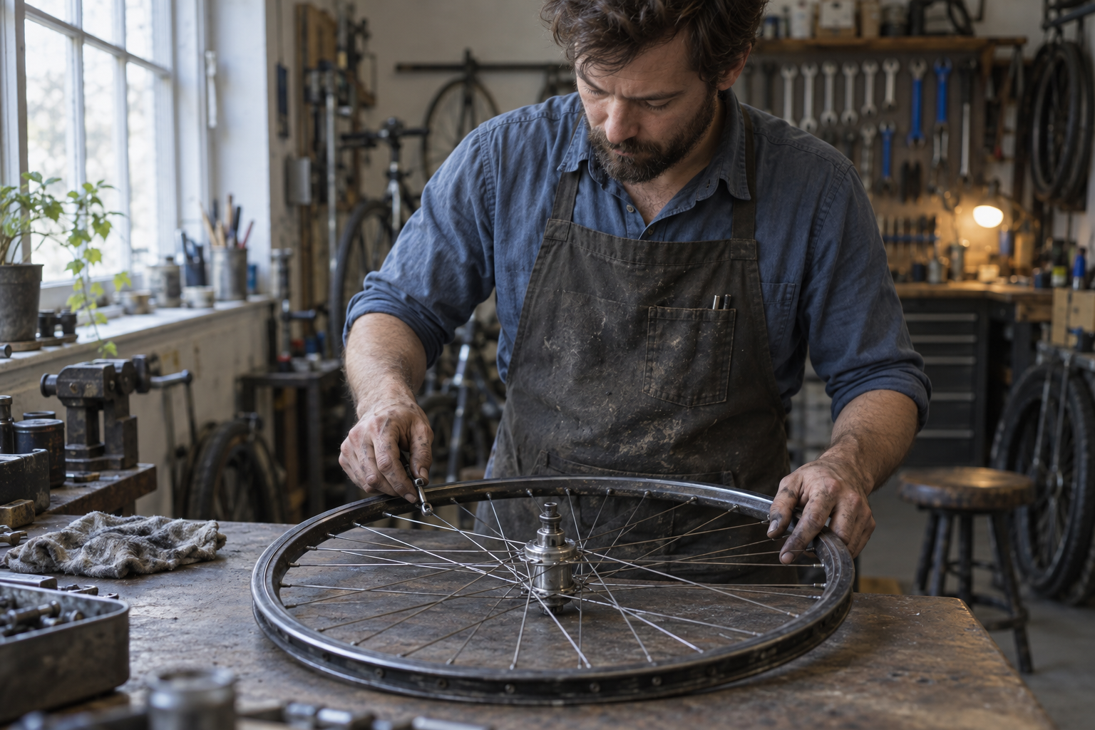
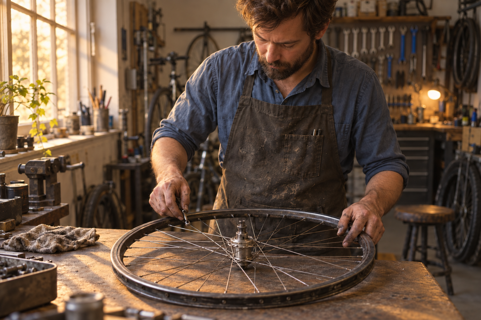
Read and copy the lighting revision
Edit the supplied bicycle-workshop photograph. Change the light from the left window to warmer late-afternoon sunlight, with a gentle longer shadow across the workbench. Keep the same mechanic, facial features, expression, clothing, hand positions, wheel, spoke key, shelves, practical lamp, camera position, crop, and object count. Allow only the light color, intensity, reflections, and shadows needed for this lighting change. Do not add a sunset view, new tools, a second wheel, new lettering, or a different pose.
What this pair shows. The edit adds warm light from the left and stronger light-and-shadow patches on the bench. The wheel, hands, apron, and background lamp remain in recognizable positions. This is a visual comparison, not a pixel-level preservation test. The hand/tool contact also deserves its own inspection; an attractive workshop image does not verify a mechanical procedure.
If the pose moves while the light improves, reject the pose change. Return to the starting photo and narrow the request, or retain the original subject in a conventional editor. The accepted version should satisfy both the requested change and the protected details.
Character continuity: approve the reference before the story
A name alone is not a character specification. Establish a reference with visible proportions, face design, distinctive marks, clothing or accessories, and a consistent medium. Keep a short list of traits beside the reference. For Pip, that list includes the two eyes with no mouth, ivory chest triangle, cream-tipped antenna, navy boots, and mustard satchel.
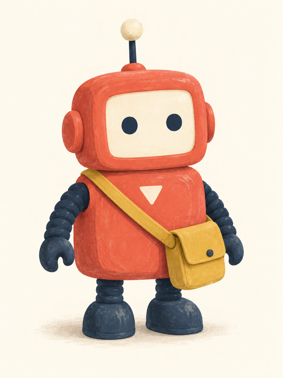
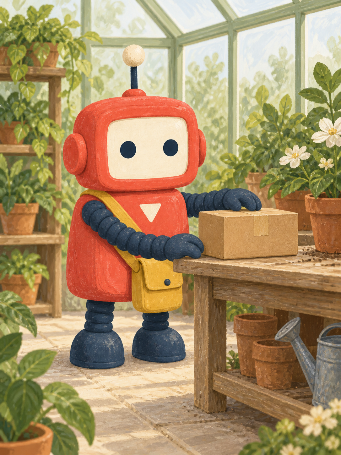
Read and copy the character-reference prompt
Create one original picture-book character reference: Pip, a small coral-red parcel-delivery robot, standing in a relaxed front three-quarter view on a pale cream background. Pip has a rounded rectangular body, a square pale face screen containing exactly two navy circular eyes and no mouth, short navy accordion arms, two squat navy boots, one short straight antenna with a cream round tip, and a small ivory downward-pointing triangle centered on the chest. A mustard-yellow canvas satchel hangs from the robot's left shoulder across the torso to its right hip. Use flat gouache shapes, subtle dry-brush texture, soft shadows, and a restrained coral, navy, mustard, and cream palette. Keep the whole character, boots, antenna, and satchel visible. No text, extra characters, extra limbs, logos, scenery, or model-sheet panels. Portrait 3:4 composition.
Read and copy the continuation prompt
Use the supplied Pip character illustration as the visual reference. Show the same small coral-red delivery robot placing one plain brown parcel on a low potting bench in a bright greenhouse. Keep the square pale face screen, exactly two navy circular eyes with no mouth, short navy accordion arms, squat navy boots, straight antenna with a cream round tip, ivory downward-pointing chest triangle, and mustard satchel at the robot's right hip. Preserve the original body proportions, gouache texture, and limited color palette. Change only the pose and surroundings needed for the delivery: one hand steadies the parcel, the other rests beside it. Keep the full character visible; place leafy pots in the background without covering the face, chest mark, boots, or satchel. No text, extra robots, extra parcels, new clothing, or altered face design. Portrait 3:4 composition.
What this pair shows. Pip retains the coral body, two navy eyes, chest triangle, antenna, boots, and mustard bag in the new scene. But the starting image puts the bag on the viewer’s right, despite the brief specifying the robot’s right hip. We kept this first output to expose the problem: a reference can carry forward a detail that already missed the brief. Resolve a required side or placement before approving a production reference.
Use a visible-side description or a marked reference when left and right are critical. On later pages, compare the character with the approved reference as well as with the previous page. If both are uploaded, assign one to character design and the other to scene continuity. Do not let an accumulated change become the new definition of the character.
Decide whether to refine or restart
Sort a disappointing result into one of three groups before you rewrite. This keeps a small correction from turning into a different project.
| What failed? | Next move | What to inspect again |
|---|---|---|
| The brief was ambiguous | Clarify counts, placement, or reference roles. The recipe’s extra lemon is an example. | Every frame or region affected by the new constraint. |
| A clear instruction was missed | Request one focused correction, or restart from the original if an edit drifted. | The corrected detail and everything previously approved. |
| The task requires exact source fidelity | Keep critical objects or text in a conventional editor instead of rerendering them. | The actual source layer, lettering, or measurement. |
Swipe the table sideways to read all three columns.
Use a keep / change / check revision
Write what to keep, name one change, then use a separate checklist to judge the returned image. The checklist is for you; do not ask the model to certify its own accuracy. A useful next instruction might be: “Keep the room and furniture. Change only the rug’s border to ivory.”
When continuing an edit in this browser workflow, download the version you want to keep and upload it as the next reference. If that version already changed something important, return to the original instead. Keep copies of both; the last output is not automatically the best starting point.
Give multiple references different jobs
Number references in the same order you upload them. For example: “Image 1 defines the room, furniture, and camera angle. Image 2 supplies only the rug’s color and weave. Keep the rug footprint from image 1.” Avoid asking to “combine these” when only one feature should transfer. Check the thumbnail order before submitting.
Our separate photo-editing review records a useful caution: the first lighting edit in the tested lakeside chains replaced the original overcast sky, and later edits largely kept that new interpretation. The guide’s practical takeaway is to compare with the original after every step, including steps that appear successful.
Set a personal retry limit before starting. If the same important detail fails repeatedly, change the workflow rather than merely adding stronger adjectives. A manual headline, a preserved product layer, or separately assembled panels may solve the actual problem.
Keep prompt choices separate from browser settings
The prompt describes the picture. The controls select the mode, model, aspect ratio, resolution, quality, and file format. Writing “4K” in a paragraph does not select the website’s 4K control. Check the controls before generating, especially after switching between examples.
- Choose the mode. Use Text to image for a new composition. Use Edit image for a supplied photo; the current uploader accepts JPG, PNG, and WebP, up to 16 files at 10 MB each.
- Match the shape to the job. Choose a wide ratio for a cover or a portrait ratio for a poster. Auto in editing follows the first reference. A ratio is not a print-size guarantee; inspect the downloaded dimensions.
- Start with an inspectable draft. The examples suggest Medium and 1K for an initial check. These are editorial starting points, not measured optimal settings. The interface also offers 2K and 4K, additional quality levels, and PNG, JPEG, or WebP output.
- Check cost before submission. Model, quality, and resolution affect credits. Use the displayed estimate and the current credit-cost tables; do not assume that a faster result costs fewer credits.
Flare or Sunburst?
OpenAI positions Flare for speed and Sunburst for demanding image quality. Its documentation also recommends evaluating the choices on your own work. That is a starting point, not a guarantee that one option will win your particular brief.
For a fair comparison, keep the English prompt, reference order, aspect ratio, resolution, and selected quality the same. Judge both against your checklist before comparing the time. The Flare vs Sunburst review provides separate website observations with prompts, outputs, and limitations; the generated illustrations on this page do not extend that benchmark.
Questions about image prompts
What should a GPT Image 2.5 prompt include?
Name the deliverable, subject, layout, visual treatment, and any exact text. For an edit, add the allowed change and the details that must stay. Prioritize the requirements that make the image usable; you do not need to fill every field for a simple idea.
How long should my prompt be?
Use enough detail to remove important ambiguity. A short prompt can work for a loose concept. A product edit or multi-panel scene needs more constraints. Remove repeated style words and contradictory requests before adding length.
Do I need an API key to use these examples?
No. Copy a prompt into the website’s browser generator. Select Edit image and add the specified reference when needed. This website does not offer a public API. Account access and credits are managed through the site interface.
Where do I put a negative prompt?
The current interface has one Prompt field, not a separate negative-prompt control. Write a short “Avoid…” or “Do not…” sentence in that field. Name concrete errors, such as extra objects or changed lettering, rather than pasting a long generic exclusion list.
Can a prompt guarantee unchanged faces, logos, or product details?
No. Protected-detail instructions describe the target but do not guarantee exact preservation. Compare the output with the original. If exact pixels, lettering, or dimensions are essential, keep those elements in a conventional editor or add them after generation.
Should I always use Sunburst or the highest quality setting?
No single choice is best for every brief. Compare candidates against the same acceptance checklist. Keep model and output settings stable while diagnosing a prompt, then test one setting change at a time. Check the displayed credit cost before generating.
Does writing a prompt as JSON improve the image?
Structured fields can make a complex brief easier to maintain, but the format is not an extra image control. Use clear labels or ordinary sentences, remove conflicts, and judge the result against the same requirements. Choose the format you can revise accurately.
Why does a PNG still have a white background?
PNG can store transparency, but a PNG file can also be completely opaque. The current website has no explicit transparency switch. Check the actual output over contrasting layers in an image editor, including openings and edges. A drawn checkerboard is part of the picture, not proof of transparency.
How do I keep the same character across several images?
Approve a clear character reference first, then supply it for new scenes. Repeat the identifying traits and say what the scene may change. Compare every output with the approved reference; using only the previous output can carry mistakes into later images.
Can I use a generated chart or scientific diagram without checking it?
Check the facts, labels, connections, units, and visual proportions against your source material. An accurate-looking diagram may encode a wrong relationship. Use a charting or diagram tool when exact geometry, accessible data, or frequent updates matter, and get subject review for educational material.
Sources, authorship, and illustration method
This guide is published by GPT Image 2.5, the independent website behind the linked generator. It was prepared with AI assistance for this site and checked against the visible browser controls, local image records, and the sources below on September 10, 2026. It is not an OpenAI publication or an independent review of this website.
The playbook prompts, illustrated case briefs, and reference-image prompts were written for this article. Thirty-six imagegen requests produced the displayed assets: the original eleven illustrations, sixteen additional playbook results, and nine new synthetic reference images. Every one of the seventeen playbook prompts now has its own result. All first outputs are included, with observed deviations described beside them. Suggested repair prompts remain unexecuted suggestions. No blinded evaluation, Flare/Sunburst attribution, or reliability percentage is claimed.
The original PNGs are preserved. WebP display copies are resized and compressed for reading on the web. The generation record contains the exact prompts, reference relationships, dates, and original dimensions. The tool did not expose its underlying model version or the website’s quality settings.
- OpenAI image prompting guide — model positioning and general generation/editing guidance; its API controls are not instructions for this website.
- GPT Image 2.5 review — separately documented website tests and limits.
- Photo-editing test results — see the photo review for prompts and observations from the editing tests.
Found a mismatch between the instructions and the current interface? Contact us with the section and setting. We update this guide when the examples, controls, or supporting evidence change.
Start with one brief you can judge.
Pick an example, replace its details, and write your three must-pass checks. Keep the first result that meets the job—not simply the most dramatic image.
Try your prompt